Preview image. Unlock full-res
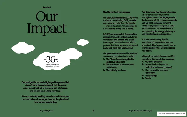
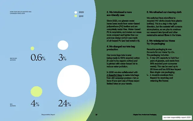
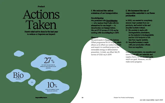
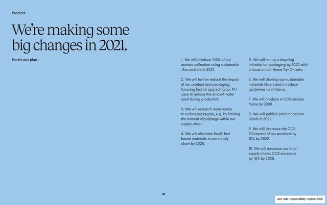
A white spread with a serif question headline, a large light-blue line drawing of glasses, and a descending row of proportional blue blobs charting each production stage's CO2 share.
Summary
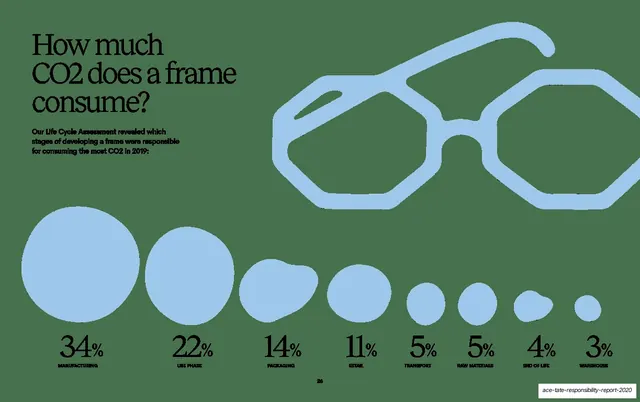
A data spread answering "How much CO2 does a frame consume?" with a row of proportional blue blobs sized to each production stage's emissions share, under a large blue line drawing of glasses.
Visual description
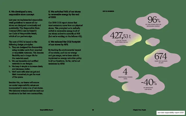
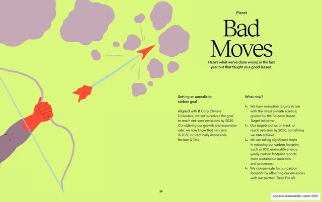
White background. The upper-left carries a serif three-line headline, "How much CO2 does a frame consume?", with a short sans-serif sub-line about which stages consumed the most CO2 in 2019. The upper-right is a large light-blue, rounded line illustration of a pair of glasses. Across the bottom runs a proportional bubble chart: eight light-blue blobs decreasing in size left to right, each with a serif percentage and an all-caps label beneath, "34% MANUFACTURING", "22% USE PHASE", "14% PACKAGING", "11% RETAIL", "5% TRANSPORT", "5% RAW MATERIALS", "4% END OF LIFE", "3% WAREHOUSE". Page number 26 is centered at the bottom.
Key takeaway
The proportional-blob chart: sizing soft organic shapes to their values gives an instantly readable ranking without axes or gridlines, and the blob language matches the rest of the deck. Posing the data as a plain-language question headline frames the whole chart.
Reuse notes
Excellent for breaking a single total into ranked contributions (emissions, budget, time) when precision matters less than relative scale. The descending-blob row reads at a glance and scales to many categories. Keep labels short and all-caps; the organic shapes only work if the size differences are honest.
From this deck: Product CO2 per frame, proportional blob chart
View deck












More like this





Keep what you find
A free account saves references to boards and can send you a weekly email of picks based on what you save.
To see every result, go Pro.