Preview image. Unlock full-res
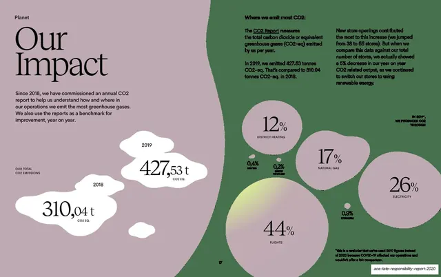
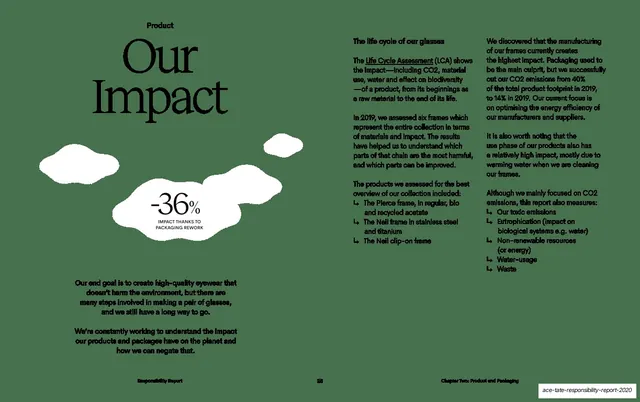
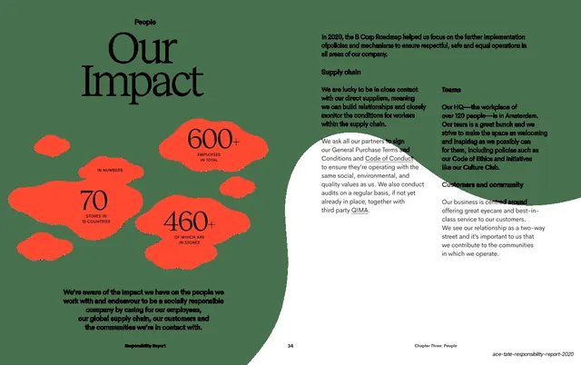
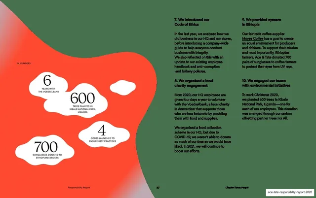
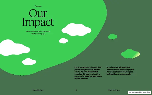
Dusty mauve data spread with an oversized serif "Our Impact" heading, two white blob figures comparing yearly CO2 totals, and a constellation of blob-bubbles showing emissions percentages by source.
Summary
A data spread: an oversized serif "Our Impact" heading and explanatory copy on the left, two white blob shapes comparing 2018 and 2019 CO2 totals, and a scatter of bubbles showing the percentage of emissions by source.
Visual description
Dusty mauve background. Upper-left, an oversized serif "Our / Impact" heading over a short sans-serif paragraph about the annual CO2 report. Lower-left, two white organic blob shapes act as labels, one reading "2018 310,04 t CO2 EQ." and the larger "2019 427,53 t CO2 EQ." for a year-on-year comparison. The right two-thirds carries a constellation of round bubbles of varying size, each a percentage with a small all-caps source label: "44% FLIGHTS", "26% ELECTRICITY", "17% NATURAL GAS", "12% DISTRICT HEATING" and smaller ones, with the big numbers in serif. Short sans-serif body copy at the top right explains where CO2 is emitted. A page number "17" sits at the bottom center.
Key takeaway
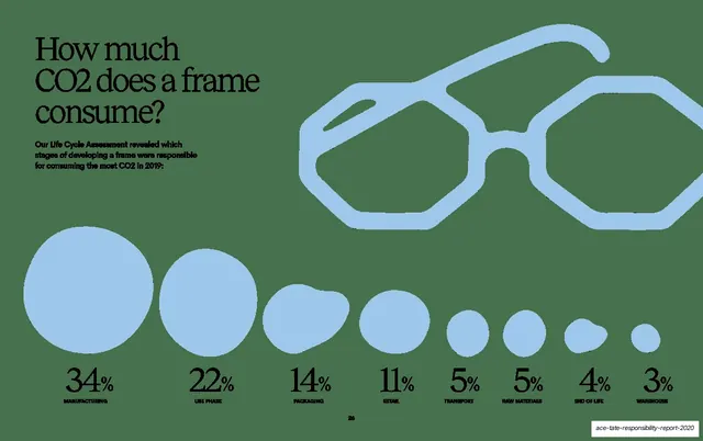
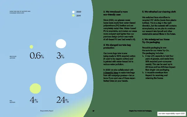
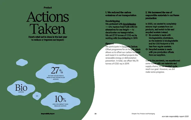
Turning hard emissions data into organic blob and bubble shapes instead of a bar chart, so the data spread stays inside the deck's soft visual language while still ranking sources by bubble size. The two year-total blobs make a simple before/after comparison legible at a glance.
Reuse notes
A good model for a data or impact-metrics page that needs to feel on-brand rather than spreadsheet-like. Bubble sizing communicates relative scale but is imprecise, so pair every bubble with its number. Best when the brand already uses organic shapes elsewhere, as this deck does.
From this deck: Our Impact CO2 emissions data
View deck















More like this





Keep what you find
A free account saves references to boards and can send you a weekly email of picks based on what you save.
To see every result, go Pro.