Preview image. Unlock full-res
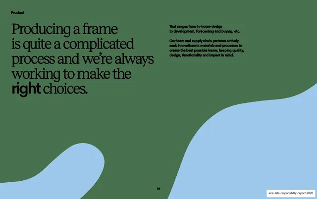
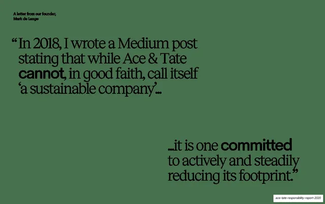
Dark green slide with a two-part serif pull-quote from the founder, set diagonally top-left to bottom-right with key words bolded.
Summary
A founder-letter opener: a long serif pull-quote split into two blocks running diagonally across a deep green field, with emphasis words set in a heavier weight.
Visual description
Deep muted forest-green background. A small all-caps label, "A letter from our founder, Mark de Lange", sits top-left. A large serif quote opens top-left ("In 2018, I wrote a Medium post stating that while Ace & Tate cannot, in good faith, call itself 'a sustainable company'...") and resolves in a second block at the bottom-right ("...it is one committed to actively and steadily reducing its footprint."). The quote is mixed-weight serif, with the words "cannot" and "committed" set in a bold sans-serif for emphasis. The two blocks are placed on a diagonal with a large empty middle.
Key takeaway
Splitting one quote into two corner-anchored blocks to create a diagonal reading path and let negative space do the pacing. Swapping single emphasis words into a bold sans inside a serif quote is a clean way to stress meaning.
Reuse notes
Good for a founder letter, manifesto, or chapter epigraph where the words should feel weighed and deliberate. The diagonal split needs a fairly short quote; long copy would crowd the empty center. Works on a dark field.
From this deck: Founder letter pull-quote
View deck