Preview image. Unlock full-res
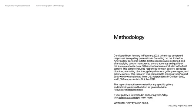
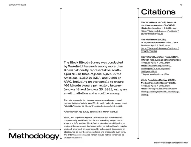
A methodology slide with the headline and a multi-paragraph explanation of the survey, both set in the right half of a white field.
Summary
A methodology slide: the headline "Methodology" with several paragraphs describing the survey window, sample sizes and a disclaimer, all placed in the right half of an otherwise empty white slide.
Visual description
White field, utility header page 26. The content sits entirely in the right half: "Methodology" as a medium near-black headline, then a block of body copy explaining the January-February 2022 survey, the 1,321 responses collected and 873 analyzed, comparisons to prior years, a general-advice disclaimer, a partner-inquiry line with an underlined link, and a final "Written for Artsy by Justin Kamp" credit. The left half is blank white.
Key takeaway
Closing the data sections with the same right-half, whitespace-heavy text layout used for the opening "About" slide, bookending the report. The restrained single-column treatment makes legal and methodological fine print feel intentional rather than tacked on.
Reuse notes
A reusable methodology, disclosure, or sources slide for any research deck. Mirroring the layout of the "about" slide gives the deck a tidy open/close symmetry. Keep it to one column in a half-slide; this is fine print, so it should read calm and recede.
From this deck: Methodology
View deck





More like this



Keep what you find
A free account saves references to boards and can send you a weekly email of picks based on what you save.
To see every result, go Pro.