Preview image. Unlock full-res
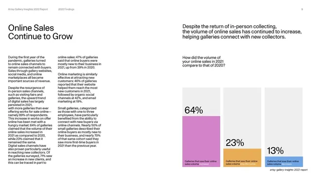
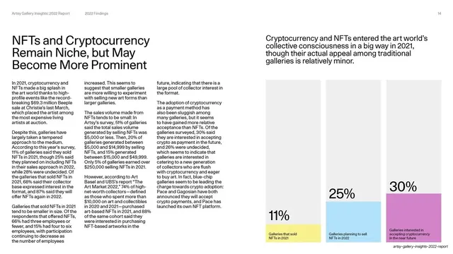
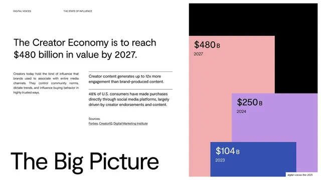
A findings deep-dive with a headline and two-column body on the left and a three-bar block chart (64/23/13 percent) made of solid color rectangles on the right.
Summary
A deep-dive on online sales growth: a headline plus dense two-column body on the left, and on the right a short takeaway line above a three-bar block chart reading 64%, 23%, 13%.
Visual description
White slide, utility header "2022 Findings", page 9. Left half: the headline "Online Sales Continue to Grow" in medium near-black sans, with two narrow columns of small justified body copy beneath. Right half: a takeaway sentence, then the question "How did the volume of online sales in 2021 compare to that of 2020?", then a bar chart built from three solid rectangles of different heights, colored orchid, marigold and peach, each topped inside with a giant percentage (64%, 23%, 13%) and a small caption (increase / stay the same / decrease). The bars sit on faint gray track rectangles.
Key takeaway
The block-bar chart: instead of thin bars on an axis, each value is a full-width column of flat color with the percentage set huge inside it. It reads instantly from across a room and turns a simple three-value stat into a graphic. Pairing it with a one-line takeaway above keeps the meaning clear.
Reuse notes
The core data-slide template for this deck and a strong general pattern for survey or report findings. Reuse wherever you have two to four comparable percentages. Keep the dense explanatory copy on the opposite side so the chart stays clean. Bar colors should come from the deck palette.
From this deck: Online Sales Continue to Grow
View deck



More like this







Keep what you find
A free account saves references to boards and can send you a weekly email of picks based on what you save.
To see every result, go Pro.