Preview image. Unlock full-res
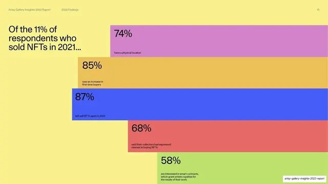
A stat slide on a yellow field where five overlapping color-block bars cascade down the right, each a percentage about NFT sellers.
Summary
A statistic showcase on a yellow ground: the headline "Of the 11% of respondents who sold NFTs in 2021..." at top-left, with five overlapping horizontal color bars cascading down the right side, each holding a big percentage and a caption.
Visual description
The whole slide is butter-yellow. Top-left: the headline in medium black sans. Down the right two-thirds, five full-width-reaching horizontal rectangles of different colors (orchid, marigold, cornflower blue, coral, lime) are stacked in a descending staircase, each offset and slightly overlapping the one above. Each bar carries a large black percentage at its left edge (74%, 85%, 87%, 68%, 58%) with a small caption beneath it (have a physical location / saw an increase in first-time buyers / will sell NFTs again in 2022 / collectors expressed interest in buying NFTs / interested in smart contracts).
Key takeaway
Turning a list of five separate stats into a single cascading staircase of overlapping color bars. It feels dynamic and editorial rather than like a table, the overlap creates depth on a flat slide, and the shared yellow ground unifies the otherwise multicolor bars.
Reuse notes
A good pattern for presenting several independent statistics about one group without a chart axis. Works when the numbers are not directly comparable (so a bar chart would mislead). Keep the bars overlapping and offset for energy; set them all on one accent ground so the multicolor does not feel random.
From this deck: Of the 11% who sold NFTs in 2021
View deck


More like this





Keep what you find
A free account saves references to boards and can send you a weekly email of picks based on what you save.
To see every result, go Pro.