Preview image. Unlock full-res
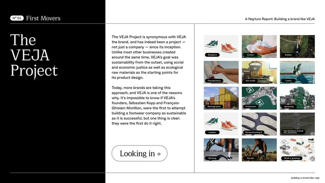
A three-zone slide pairing a black headline panel, a body-copy column, and a 12-cell captioned thumbnail grid illustrating the VEJA Project.
Summary
The first detailed category slide (N° 01 First Movers): a black headline panel on the left, two columns of body copy in the middle, and a dense 4-by-5 grid of small captioned photo thumbnails on the right illustrating "The VEJA Project".
Visual description
Three vertical zones divided by hairlines. Left: a black panel with a white "N° 01 First Movers" pill on a rule, then an oversized white serif headline "The / VEJA / Project" stacked, and an outlined pill "Looking in ->" at the bottom. Middle: two paragraphs of sans-serif body copy about VEJA as a sustainability-first project. Right: a tight grid of roughly twenty small rectangular photo tiles, each with a tiny label (Sneakers, Cotton, Rubber, Transparency, Fair trade, Limits, Reintegration, Production, Upcycling, Leather, Running, No ads, and so on), forming a mosaic of the brand's themes.
Key takeaway
Combining a bold black title panel, a readable copy column, and a contact-sheet grid of labeled thumbnails lets one slide set the chapter, explain it, and preview its breadth at once. The mini-captions turn a photo grid into a scannable index of topics.
Reuse notes
A strong opener for a deep-dive section that has many sub-topics to foreshadow. The thumbnail grid needs consistent crops and short labels to stay tidy. The black-panel-plus-copy-plus-grid structure is the deck's case-study template and recurs with different accent colors.
From this deck: First Movers The VEJA Project overview
View deck















More like this







Keep what you find
A free account saves references to boards and can send you a weekly email of picks based on what you save.
To see every result, go Pro.