Preview image. Unlock full-res
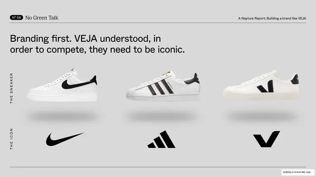
Light slide with a sans headline over a three-column comparison: Nike, Adidas and VEJA sneakers in one row above their brand icons in the row below.
Summary
A light comparison slide: a sans headline tops a clean three-column grid that places Nike, Adidas and VEJA sneakers in the upper row and their respective brand icons in the lower row.
Visual description
Pale grey background. The running header shows "N° 08 / No Green Talk" at left, the report line at right. A two-line sans headline reads "Branding first. VEJA understood, in order to compete, they need to be iconic." Below, a three-column grid: the top row, labelled vertically "THE SNEAKER" at the far left, shows three white sneakers in profile (Nike Air Force, Adidas Superstar, VEJA Campo), each with a soft drop shadow; the bottom row, labelled "THE ICON", shows the three brand marks (Nike swoosh, Adidas trefoil-bars, VEJA V) at matched scale. Hairline rules run top and bottom.
Key takeaway
Stacking product over logo in a strict matrix makes the argument ("compete by being iconic") visually self-evident: the eye reads each brand as object-plus-mark. The tiny vertical row labels organise the grid without heavy headers.
Reuse notes
A clear template for any peer or competitor comparison where each item has both a product and a symbol. Reusable by swapping the columns. Needs cleanly cut-out product shots and official logos at consistent scale; mismatched crops break the grid.
From this deck: \"Branding first\" sneaker-vs-icon comparison row
View deck

















More like this







Keep what you find
A free account saves references to boards and can send you a weekly email of picks based on what you save.
To see every result, go Pro.