
Preview image. Unlock full-res
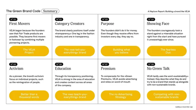
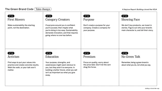
Light-blue lower band with black bubble stats on boat-vs-plane emissions, a sans headline top-left, an aerial container-ship photo top-right, and a "No Ads" next-section pill.
Summary
An infographic slide: a sans headline and four nested black/outline stat bubbles compare sea versus air freight and their CO2 share, beside an aerial photo of a container ship, with a "No Ads" next-section pill.
Visual description
The top is white, the lower two-thirds a soft light blue. The running header shows "N° 06 / Educators". Top-left a two-line sans headline, "Why shipping by boat?". Below it two solid-black circle stats with small ship and plane icons read 81% and 19%, each connected by a dotted line to an outlined circle below (5% and 95%) tagged with a small black CO2 cloud, showing the share of transport against share of emissions. Top-right, a large aerial colour photograph of a loaded container ship cutting through blue water. Lower-right, a short sans paragraph explains the figures, and an outlined "No Ads" pill with a right arrow points to the next section.
Key takeaway
Pairing nested proportional bubbles (mode share up top, emissions share below, linked by dotted lines) turns a counterintuitive statistic into an instantly readable picture. Tiny mode icons inside the bubbles do the labelling without legends.
Reuse notes
A clean pattern for a single surprising data point in a report, where the story is a contrast between two metrics. Reusable for any "small share, big impact" comparison. Keep the figures to two pairs; more bubbles would clutter. Works alongside a strong supporting photo.
From this deck: \"Why shipping by boat?\" data slide with cargo ship photo
View deck















More like this







Keep what you find
A free account saves references to boards and can send you a weekly email of picks based on what you save.
To see every result, go Pro.