Preview image. Unlock full-res
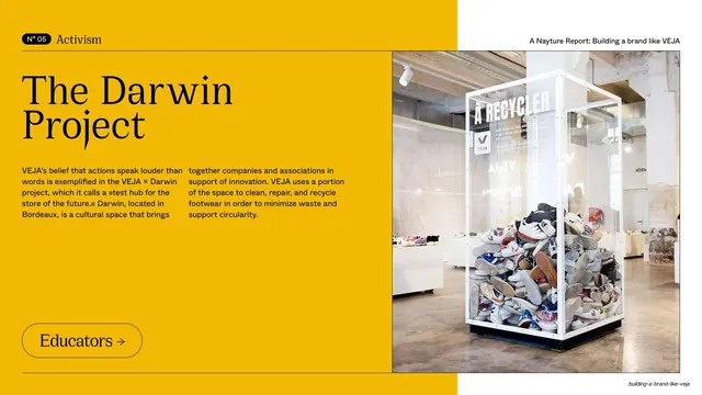
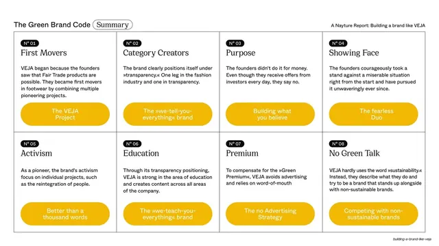
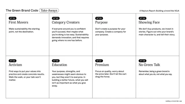
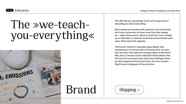
Light slide split into four quadrants by hairlines, with an oversized serif headline, three body paragraphs, a photo collage of CO2 emissions material, and a "Shipping" next-section pill.
Summary
A light slide divided by hairlines into four quadrants: an oversized serif headline top-left, three body paragraphs top-right, a printed CO2-emissions collage bottom-left, and a serif word plus a "Shipping" pill bottom-right.
Visual description
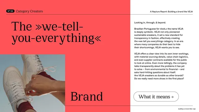
Off-white background with a thin cross of hairline rules splitting the slide into four cells. The running header reads "N° 06 / Educators" at left and the report line at right. Top-left, a large four-line serif headline, "The we-teach-you-everything", set in guillemets. Top-right, three small sans-serif paragraphs on VEJA's education and transparency. Bottom-left, a photographic collage of a printed page showing "CO2 EMISSIONS", a donut chart, and product imagery. Bottom-right, the serif word "Brand" with an outlined "Shipping" pill button and right arrow beneath it for the next section.
Key takeaway
The hairline four-quadrant grid that lets a single slide hold a headline, an argument, a piece of photographic evidence, and a navigation cue without any of them crowding. Splitting one long headline phrase across the headline and a lower quadrant ("...you-everything" then "Brand") is a playful structural trick.
Reuse notes
Use when a slide must carry several different content types at once and you want clear separation. The quadrant grid is reusable but content-hungry; sparse content leaves dead cells. Keep the headline short enough to read at the oversized size.