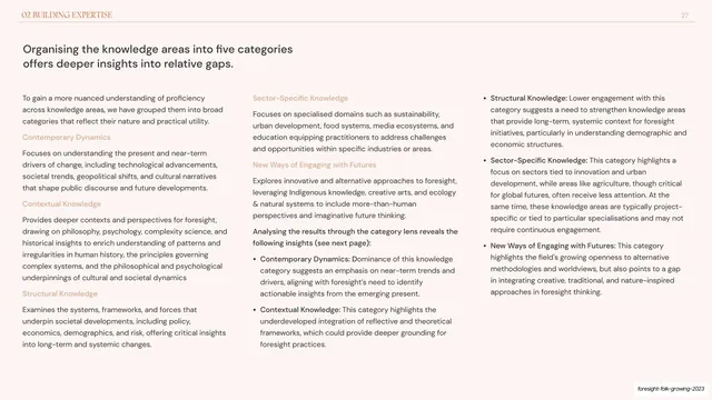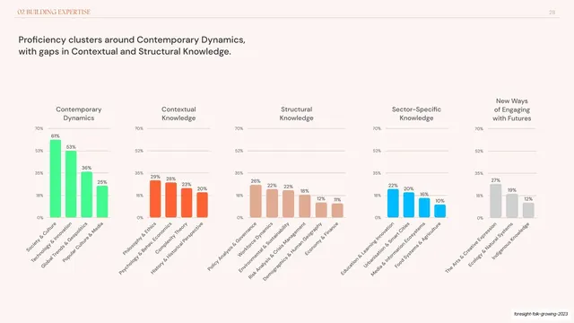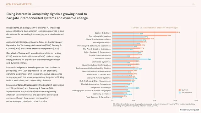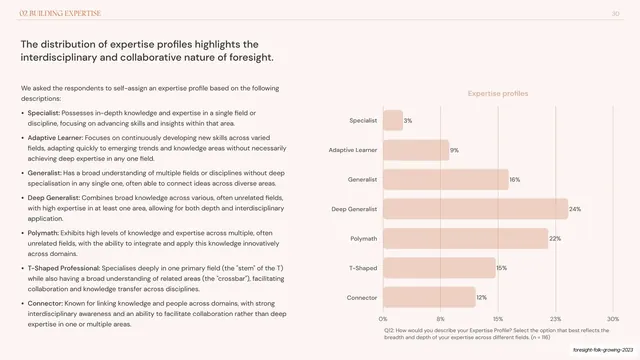
Preview image. Unlock full-res
A 65-slide research report with grainy sunrise-dune section dividers, oversized serif headlines tinted per chapter, and warm pastel data slides paired with coral-and-green charts.
Summary
A 65-slide research report by Foresight Folk surveying foresight and futures practitioners on careers, competencies, and learning. Its identity comes from two registers: full-bleed grainy illustrations of sunrise-lit dune landscapes for the cover and chapter dividers, and quiet warm-pastel data spreads that pair an oversized serif headline with two or three columns of body copy and a chart.
Visual description
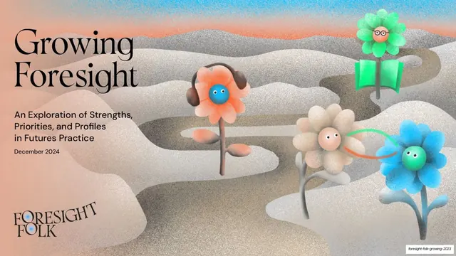
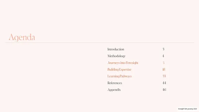
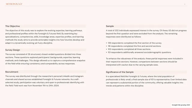
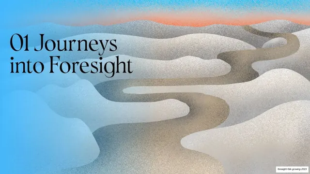
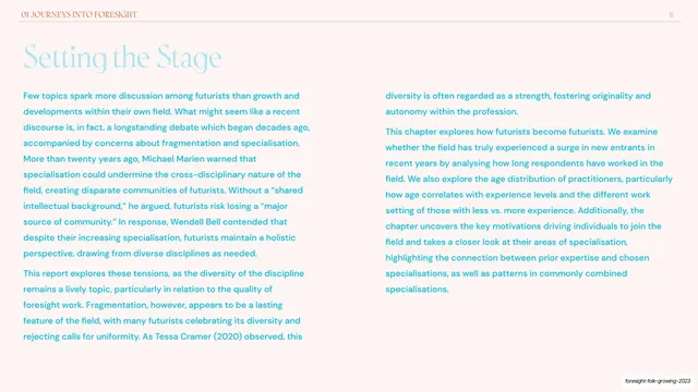
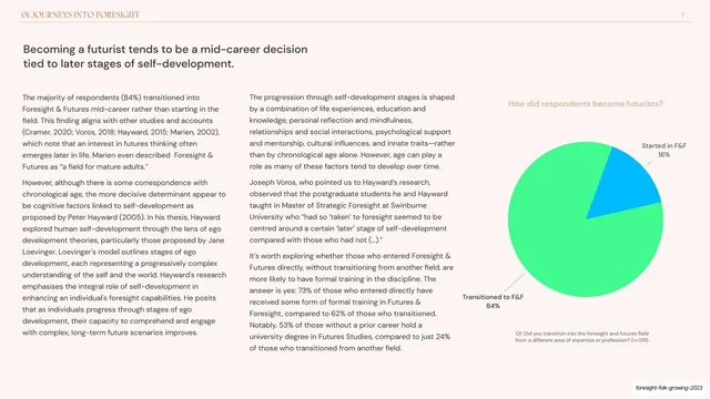
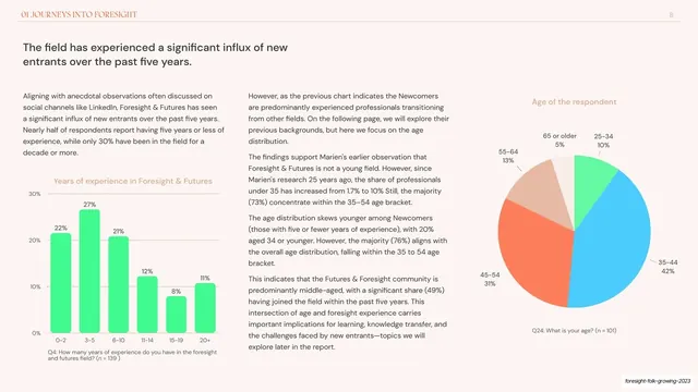
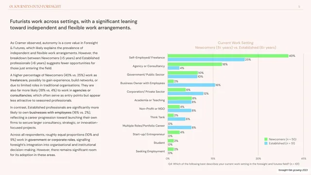
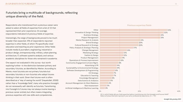
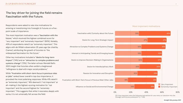
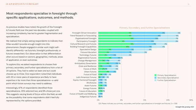
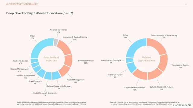
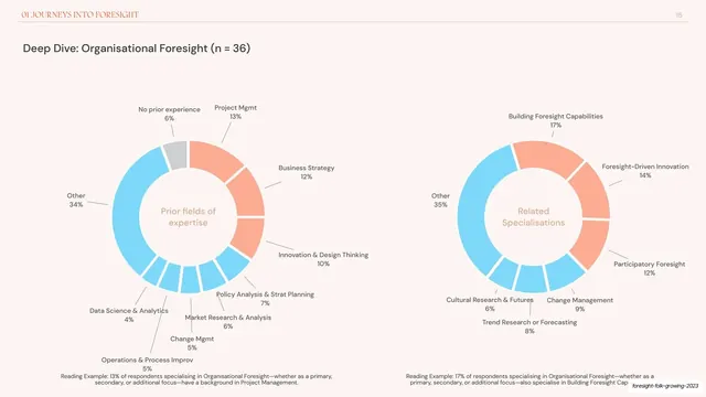
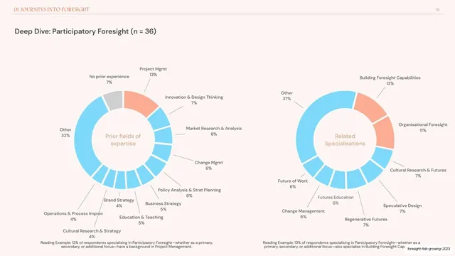
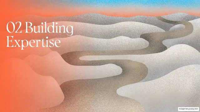
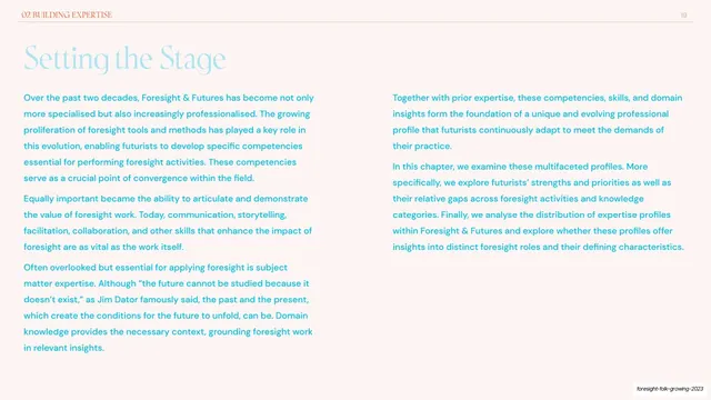
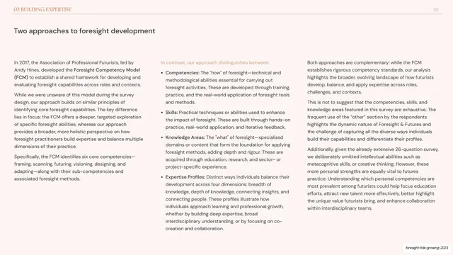
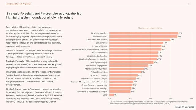
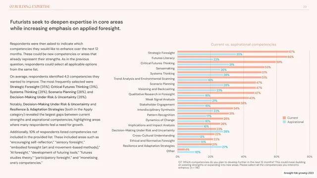
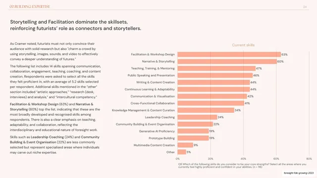
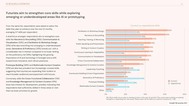
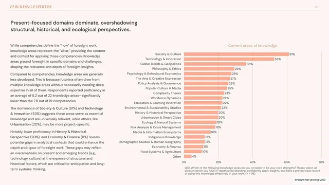
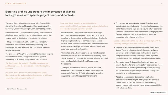
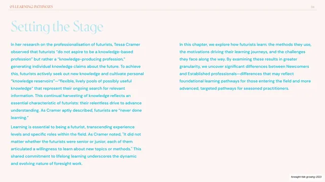
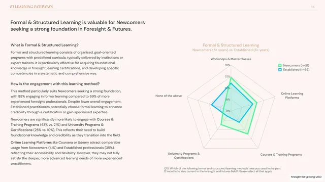
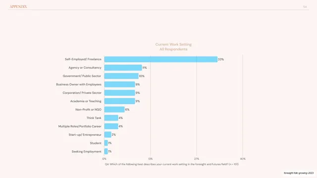
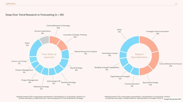
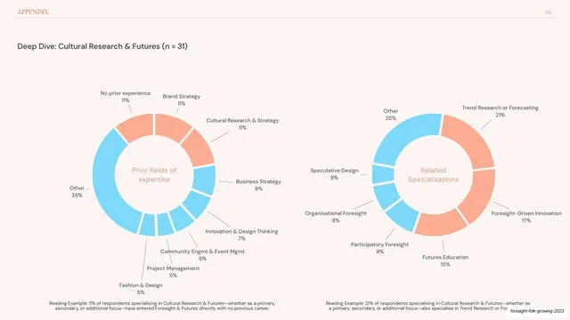
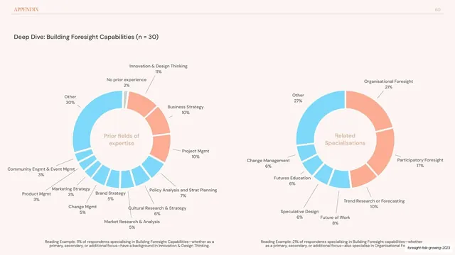
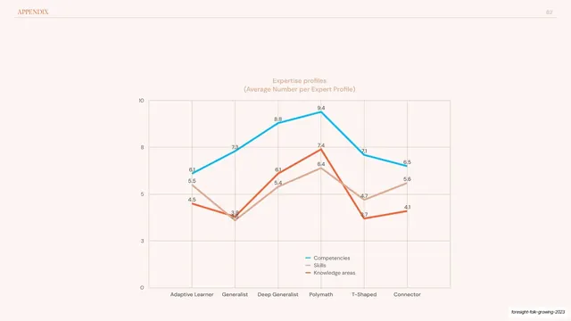
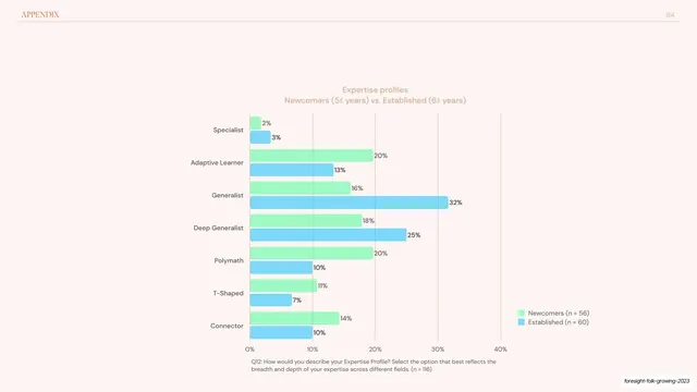
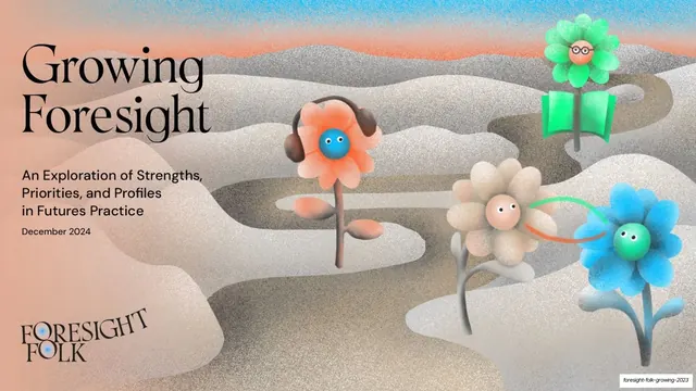
Slides run 16:9. The illustrative slides (cover and the numbered chapter openers) are dense grain-textured paintings of soft, undulating dune or cloud forms threaded by winding sand-colored paths, under a noise-gradient sky that runs from blue to coral; the cover layers in stylised flower characters with little smiling faces (one wearing headphones, one with glasses) and an open-book motif. Headlines on these run in a large serif, dark on the cream cover, near-white over the colored dividers. Content slides sit on a soft blush-cream ground (#FBEEE9) with a thin hairline running header carrying a small all-caps serif section label at top-left and a page number at top-right. The dominant move is an oversized serif headline, tinted to a per-chapter accent (chapter 01 is coral-orange, the methodology slide is a cool blue-grey), followed by body copy laid out in two or three columns, set in a humanist sans and tinted to the same accent. Many slides carry a chart on the right or below: pie and donut charts and horizontal or vertical bar charts in a recurring palette of coral-orange (#E8825E), sky-blue (#3FB6F0) and green (#5FD35A), each with a small grey question-label caption. The agenda is a right-aligned table of contents with page numbers, its active chapters tinted coral. The Foresight Folk wordmark sits a serif logotype with a small blue flower replacing a counter.
Key takeaway
The two-register rhythm: lush, textured, full-bleed illustration for covers and dividers, then disciplined calm data spreads in between, so the report breathes without losing seriousness. The grain-noise gradient skies and dune forms give a data-heavy document an editorial, almost printed-poster warmth. And the per-chapter accent color carried through headline tint, body-copy tint, and chart hues ties a long report together while signposting where you are.
Reuse notes
A strong reference for research reports, survey write-ups, whitepapers, and any long-form document that has to carry a lot of charts without feeling clinical. The serif-headline-plus-multicolumn-body template and the standard chart palette are directly reusable. The grainy dune illustrations are bespoke and would need to be commissioned or recreated; they do the heavy branding work, so a generic stock image would not substitute well. Works best in light mode on a warm paper-like ground.
From this deck: Foresight Folk: Growing Foresight 2024
View deck