Preview image. Unlock full-res
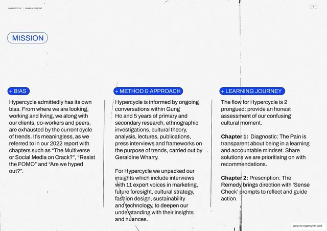
A second MISSION spread with three blue-tabbed columns (Bias, Method & Approach, Learning Journey) of body copy on white.
Summary
The companion to the previous Mission spread: same layout, three blue-tabbed columns headed "+ BIAS", "+ METHOD & APPROACH" and "+ LEARNING JOURNEY" describing the report's methodology and two-chapter structure.
Visual description
White 16:9 spread matching slide 3's grammar. The "MISSION" blue outlined pill sits top-left. Three columns of body copy fill the lower two-thirds, each opened by a small blue rounded tab. The first explains the authors' acknowledged bias, the second outlines the research method (interviews with 11 expert voices, secondary research led by Geraldine Wharry), and the third previews the two chapters: Chapter 1 Diagnostic (The Pain) and Chapter 2 Prescription (the Remedy / Sense Check). Thin vertical rules divide the columns; faint vertical toner streaks cross the page. Running header and page number at top.
Key takeaway
The consistency move: reusing the exact same three-column, blue-tab template across consecutive mission pages so the document feels systematized rather than improvised. It turns dense methodology copy into something scannable.
Reuse notes
Reuse directly for any multi-page "about / method" section. Pairs with slide 3 as a two-spread unit. Needs the surrounding deck to commit to the same pill-and-tab labelling for the system to pay off.
From this deck: Mission, bias / method / learning journey
View deck