Preview image. Unlock full-res
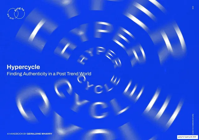
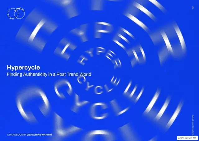
Electric-blue cover with a motion-blurred spiral of repeating HYPERCYCLE type and a small white title lockup lower-left.
Summary
The title page: a saturated electric-blue field filled with a spinning, motion-blurred spiral built from the repeated words "HYPER" and "CYCLE", with the report title set small in white at lower-left.
Visual description
Full-bleed electric blue (around #2B3BFF). The whole field is taken up by a radial, vortex-like spiral of the words "HYPER" and "CYCLE" repeated and rendered in extruded white type that smears into motion blur toward the center, reading as a hamster wheel of hype. Top-left carries the circular "we are gung ho" logo lockup in white; "2024" runs vertically in the top-right corner and a vertical "GUNG HO COMMUNICATIONS" credit runs up the right edge. Lower-left holds the title in a clean white sans: "Hypercycle" bold over "Finding Authenticity in a Post Trend World", with "A HANDBOOK BY GERALDINE WHARRY" in small caps at the very bottom.
Key takeaway
Building the entire cover from the report's own title set in motion, so the typography is both the subject and the artwork. The single saturated blue plus white motion blur gives instant energy without any photograph or illustration.
Reuse notes
A strong cover device for a report or talk whose theme is speed, cycles, or overload, where the concept can be literalized in type. Depends on a confident one-color field and clean small title type to keep it from feeling chaotic.
From this deck: Hypercycle cover, blurred spiral wordmark
View deck