Preview image. Unlock full-res
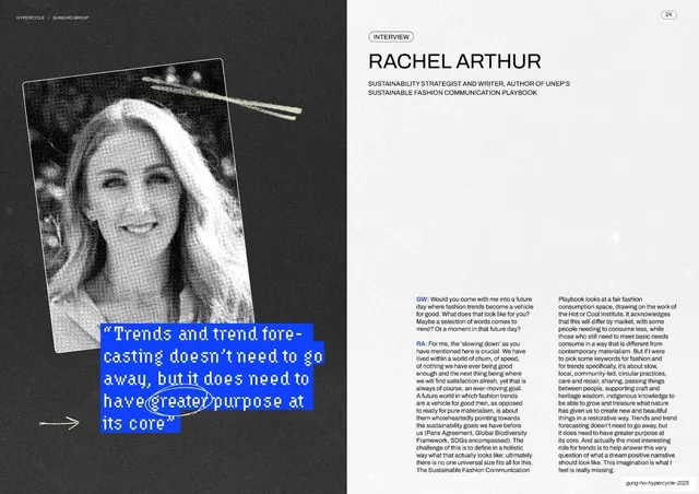
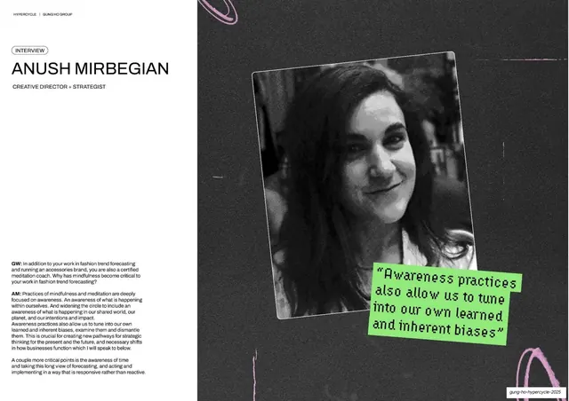
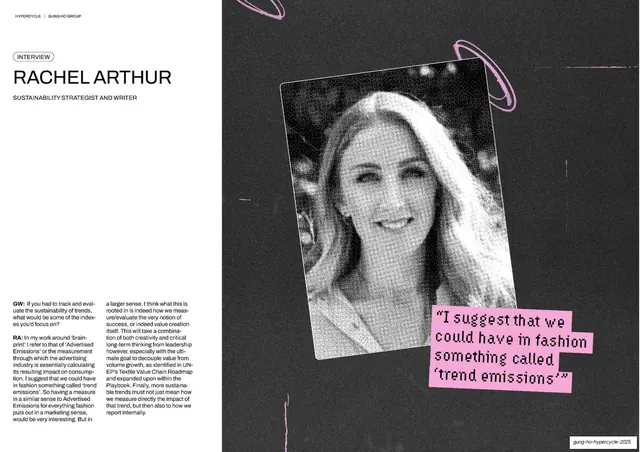
A dark interview spread with a large halftone portrait of Rachel Arthur on the left, an electric-blue handwritten-style pull-quote across it, and a Q&A column on the right.
Summary
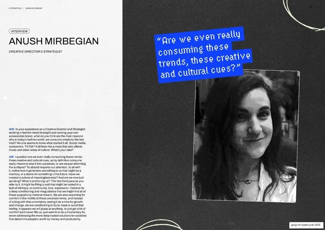
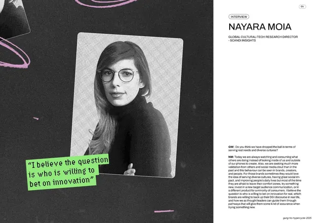
The same interview template as the Cecile Poignant spread but inverted to a near-black background, with a tall halftone portrait and a blue pixel pull-quote.
Visual description
Near-black full-bleed ground. Top-left a pill badge "INTERVIEW" sits above a large light-grey all-caps name "RACHEL ARTHUR" and a two-line role description. The left side is filled by a tall black-and-white halftone portrait of a smiling woman; overlapping its lower edge is an electric-blue card with a pixel/bitmap quote ("Trends and trend forecasting doesn't need to go away, but it does need to have greater purpose at its core"), with a small white hand-drawn arrow beside it. The right column runs a "GW:" / "RA:" Q&A in small light-grey sans-serif across two sub-columns. Running header top-left, circled "24" top-right, footer slug bottom-right.
Key takeaway
The way the interview system flips cleanly to a dark slide while keeping every component in place. On black, the halftone portrait and the electric-blue quote card gain extra punch and the deck gets visual rhythm between light and dark spreads.
Reuse notes
Use to break up a long run of light interview pages without changing the layout logic. The blue-on-black pixel quote is high-contrast and legible. Keep the role line and INTERVIEW tag identical to the light version so the series still reads as one template.
From this deck: Rachel Arthur interview
View deck





More like this







Keep what you find
A free account saves references to boards and can send you a weekly email of picks based on what you save.
To see every result, go Pro.