Preview image. Unlock full-res
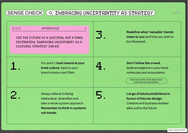
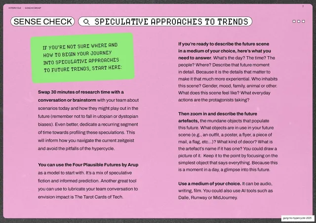
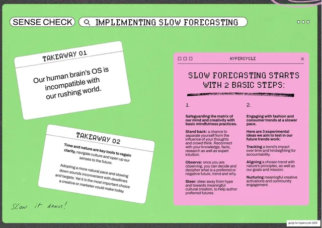
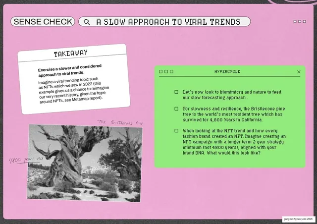
Full-bleed lime-green slide with a pill toolbar header and a two-column numbered grid of five steps, one cell replaced by a pink instruction panel.
Summary
A lime-green full-bleed framework slide: a pill-shaped toolbar header reading "SENSE CHECK / EMBRACING UNCERTAINTY AS STRATEGY" tops a two-column grid of five big-numbered steps, with the first cell turned into a pink instruction panel.
Visual description
Saturated lime-green background over a thin charcoal margin. The top row is two rounded "pill" toolbar elements: "SENSE CHECK" at left and a search-style pill "EMBRACING UNCERTAINTITY AS STRATEGY" with a magnifier glyph, plus three dots at far right. Below, a grid divided by thin rules: the top-left cell is a pink rounded faux-window panel (three squares, "HYPERCYCLE", a close X) holding intro text in pixel caps; the remaining cells hold steps numbered 1 to 5 in oversized pixel numerals, each with a bold lead phrase and a line of body copy, plus a small "Click here to learn more..." button under step 4. The footer slug sits at bottom-right.
Key takeaway
Treating a numbered framework as a UI screen, the pill "toolbar" header and one cell swapped for a pink "window" panel, so a list of steps reads like an app rather than a slide. The oversized pixel numerals make the sequence instantly scannable.
Reuse notes
A reusable layout for any "five steps", "principles", or "checklist" content that benefits from a structured grid. The toolbar-and-window dressing ties it to the deck's retro-UI motif. Cap it around five to six cells so the numerals stay large; the embedded button implies interactivity in the live file.
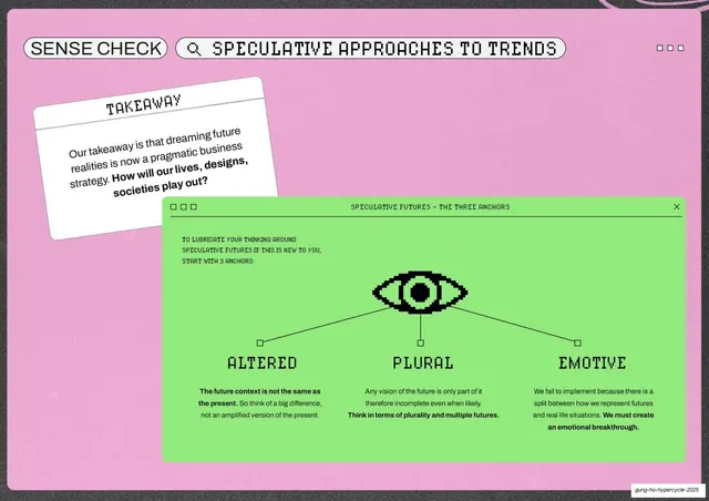
From this deck: Sense Check five-step uncertainty grid
View deck


























More like this



Keep what you find
A free account saves references to boards and can send you a weekly email of picks based on what you save.
To see every result, go Pro.