Preview image. Unlock full-res
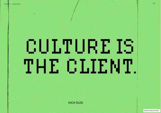
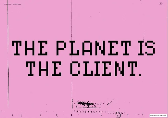
A full-bleed pink statement slide with the pixel-type line "THE PLANET IS THE CLIENT." in black, the pair to the preceding green culture slide.
Summary
The mirror of the previous slide: a flat pink field carrying the oversized black pixel-font statement "THE PLANET IS THE CLIENT." on two lines.
Visual description
Full-bleed pink background with the same faint scanned-paper texture, including a heavier band of black scan noise across the lower edge. The "HYPERCYCLE | GUNG HO GROUP" header sits top-left with a page-number pill top-right. Centered, the black bitmap/pixel display headline reads "THE PLANET IS" over "THE CLIENT.", ending in a hard period. No attribution line here, so the type sits more centered in the field than its green twin.
Key takeaway
Building a deliberate diptych: identical layout, type, and treatment as the green "CULTURE IS THE CLIENT." slide, only the brand color and the noun swapped. Repeating one slide template across two color fields turns two claims into a single rhetorical move.
Reuse notes
Best deployed immediately after its paired slide so the audience reads them as a set. The flat pink plus distressed scan texture is a clean, reusable pause-slide recipe. As with its twin, it lives or dies on the headline typeface and a punchy line.
From this deck: The planet is the client statement slide
View deck