Preview image. Unlock full-res
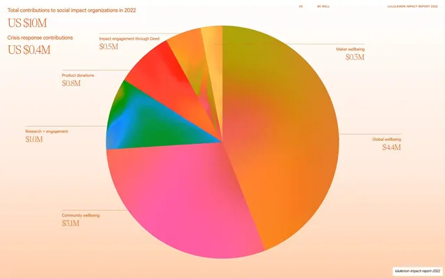
A large multicolor pie chart breaking down US $10M of 2022 social-impact contributions, with leader-line labels around it on a warm peach gradient.
Summary
A single big pie chart owns the slide, its slices in saturated multicolor against a warm peach gradient, with a headline stat at top-left and category values pinned around the circle by leader lines.
Visual description
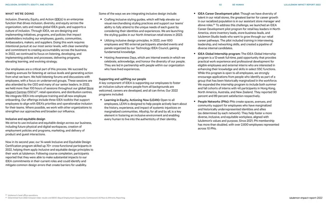
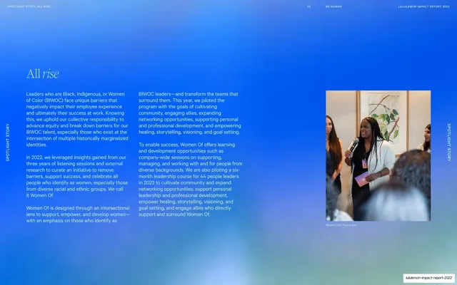
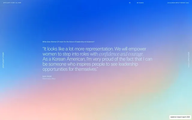
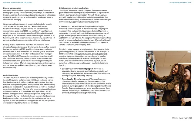
Warm peach gradient field. Top-left stacks a small orange title ("Total contributions to social impact organizations in 2022") above an oversized serif "US $10M", then a second pair ("Crisis response contributions" / "US $0.4M"). A large pie chart fills the right two-thirds, its wedges in vivid orange, magenta-pink, green, blue, red, and lime, some with a subtle iridescent gradient. Thin horizontal leader lines run from each wedge to a label set in small orange caps over a serif dollar figure (Maker wellbeing $0.3M, Global wellbeing $4.4M, Community wellbeing $3.1M, Research + engagement $1.0M, Product donations $0.8M, Impact engagement through Deed $0.5M). The standard running header sits across the top; wordmark bottom-right.
Key takeaway
Pairing a quiet monochrome-orange title and oversized serif headline number with a loud, saturated pie so one chart carries the page. The thin leader-line labels keep the data legible without a boxed legend.
Reuse notes
Good for a financial or allocation slide where one breakdown is the whole story. The bright multicolor wedges read as celebratory rather than clinical; fitting for impact or giving reports. With this many slices, leader-line labels are essential; a stacked legend would feel cramped.
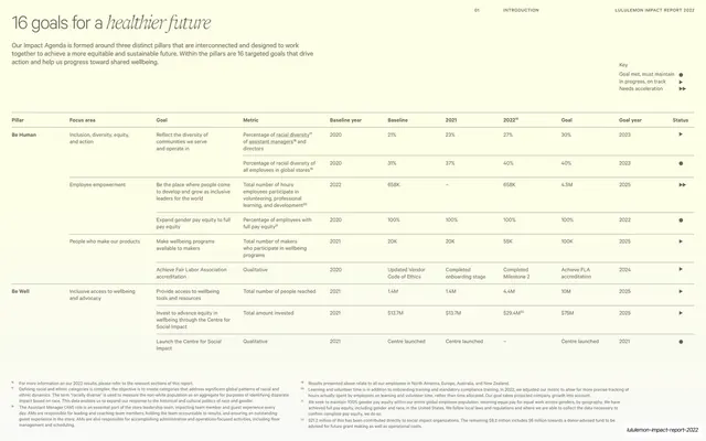
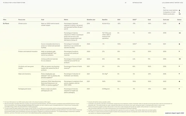
From this deck: Total social impact contributions pie chart, US $10M
View deck








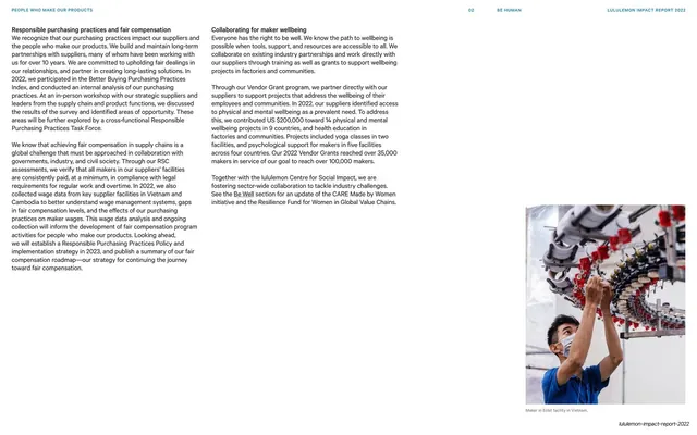




More like this





Keep what you find
A free account saves references to boards and can send you a weekly email of picks based on what you save.
To see every result, go Pro.