Preview image. Unlock full-res
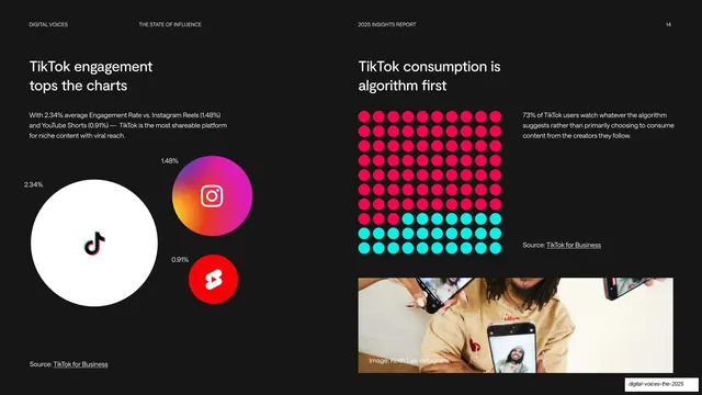
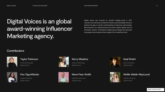
Dark two-panel data slide pairing a platform-logo bubble comparison on the left with a red-and-cyan dot-grid stat and a photo on the right.
Summary
A dark two-panel data slide: the left panel compares platform engagement with sized logo bubbles (TikTok 2.34%, Instagram 1.48%, YouTube Shorts 0.91%), the right pairs a red-and-cyan dot-grid stat with a supporting photo.
Visual description
Near-black background with the top utility header and page number ("14"). The left panel has a two-line heading ("TikTok engagement tops the charts"), a short intro, and three platform logos drawn as differently sized circles labeled with their engagement rates: a large white TikTok bubble, a medium gradient Instagram bubble, and a small red YouTube Shorts bubble, with an underlined "Source: TikTok for Business" credit. The right panel heads "TikTok consumption is algorithm first", states a stat, and visualizes "73%" as a 10-by-10 dot grid split into red (majority) and cyan (remainder) dots; below it sits a landscape photo of people on phones with an image credit.
Key takeaway
Two distinct data visualizations on one dark page: sizing brand logos as proportional bubbles for a quick engagement comparison, and a two-color 100-dot grid to make a single percentage tangible. Both turn numbers into instantly legible shapes while staying monochrome-plus-accent.
Reuse notes
A strong reference for data-heavy report pages: the logo-bubble comparison suits platform or competitor benchmarking, and the dot-grid is a reusable way to dramatize one percentage. The bright red/cyan accents pop on the dark ground; keep the dot grid to a clean 10-by-10 for readability.
From this deck: TikTok engagement and algorithm-first
View deck










More like this




Keep what you find
A free account saves references to boards and can send you a weekly email of picks based on what you save.
To see every result, go Pro.