Preview image. Unlock full-res
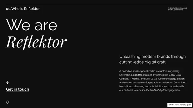
Dark studio intro with a huge "We are Reflektor" headline (Reflektor in italic serif) left and a paragraph plus Get in touch link right.
Summary
The studio introduction: an oversized "We are Reflektor" headline with the name in italic serif, balanced by a positioning paragraph and a Get in touch link.
Visual description
Near-black background under the standard "01. Who is Reflektor" header. The left two-thirds carries a huge two-line headline: "We are" in white geometric sans over "Reflektor" in a large white italic high-contrast serif. Below it, a down arrow sits above an underlined "Get in touch" link. The lower-right block holds a bold sans lead line, "Unleashing modern brands through cutting-edge digital craft.", followed by a justified paragraph describing the Canadian studio and naming clients (Coca-Cola, Cadillac, T-Mobile, STARZ), with a few phrases in italic. The diamond motif sits bottom-left.
Key takeaway
The scale contrast: an oversized italic-serif brand name doing the heavy lifting on the left while a small, dense, partly-italic paragraph carries the substance on the right. Underlining "Get in touch" beneath a down arrow makes a quiet but clear call to action.
Reuse notes
A clean "who we are" slide for agency or studio decks. The big-name-left, dense-paragraph-right split works whenever you want presence and detail on the same slide. Dropping client names into the body adds credibility cheaply.