Preview image. Unlock full-res
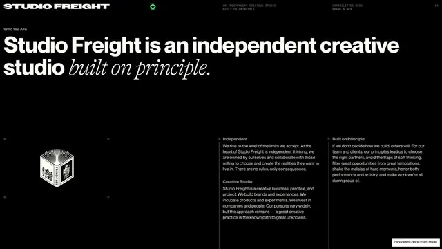
\"Who We Are\" slide with an oversized sans-plus-serif-italic headline above a three-part hairline-ruled body and a small engraved book emblem.
Summary
The "Who We Are" page: a huge two-line headline mixing bold sans with serif italic over three short titled paragraphs and a small engraved book illustration.
Visual description
Black full bleed with the standard top chrome and a small "Who We Are" label beneath it at left. The headline fills the upper third: "Studio Freight is an independent creative" in bold white sans, with "studio built on principle." resolving into a contrasting serif italic. The lower band is a body grid: a small engraved black-and-white book emblem labeled "PRINCIPLES" sits at far left inside plus-mark crop corners, and to its right two columns of small white sans body text run under bold sub-labels ("Independent", "Creative Studio", "Built on Principle"), each column separated by thin hairline rules.
Key takeaway
The signature headline move of a bold sans sentence handing off to a serif italic on the key phrase, which gives a technical dark slide an editorial, manifesto tone. The tiny engraved emblem adds a crafted, old-press touch against the clean grotesque body.
Reuse notes
A reusable "about / mission" layout: oversized mixed sans-serif headline up top, titled multi-column body below on hairline rules. Strong for studio, agency or founder-led intro slides. The serif-italic emphasis needs a serif with real character to land; a generic italic weakens it.
From this deck: Who We Are statement and principles
View deck









More like this








Keep what you find
A free account saves references to boards and can send you a weekly email of picks based on what you save.
To see every result, go Pro.