Preview image. Unlock full-res
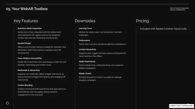
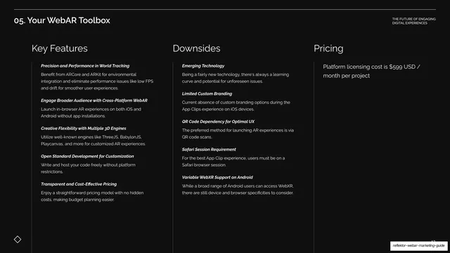
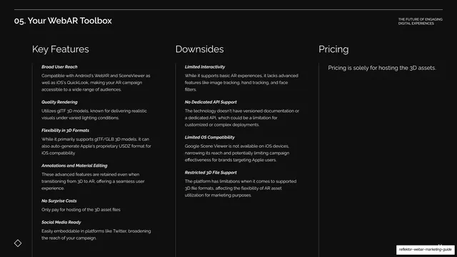
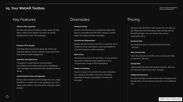
Dark three-column table comparing Adobe Aero's Key Features, Downsides, and Pricing with bold-italic sub-labels.
Summary
The Adobe Aero comparison table: three columns headed Key Features, Downsides, and Pricing, each a stack of bold-italic-labeled entries.
Visual description
Near-black background under the "05. Your WebAR Toolbox" header, no oversized title. Three columns headed "Key Features", "Downsides", and "Pricing" in white sans are divided by faint vertical hairlines. Key Features lists five bold-italic entries (Seamless Adobe Integration, Intuitive Design, Cross-Platform Accessibility, Multimedia & Interactivity, Custom Branding); Downsides lists five (Learning Curve, Performance, Limited Interactivity, Adobe Dependency, Mobile-Centric); Pricing reads "Included with Adobe Creative Cloud suite". The diamond motif sits bottom-left.
Key takeaway
The Pricing slot again carries the punchline cheaply: "Included with Creative Cloud" reads as a perk simply because it sits in the same place where rivals list dollar figures. Structural consistency does the persuading.
Reuse notes
Reuse as the standard breakdown after each spotlight. The recurring three-column ledger is the engine of the whole comparison section; keep it identical so bundled or free pricing stands out by contrast alone.
From this deck: Adobe Aero features, downsides, pricing
View deck





More like this







Keep what you find
A free account saves references to boards and can send you a weekly email of picks based on what you save.
To see every result, go Pro.