Preview image. Unlock full-res
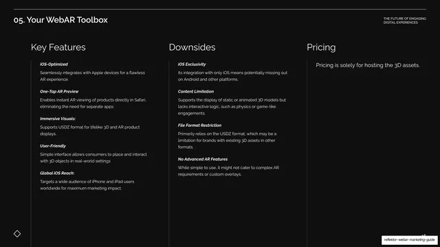
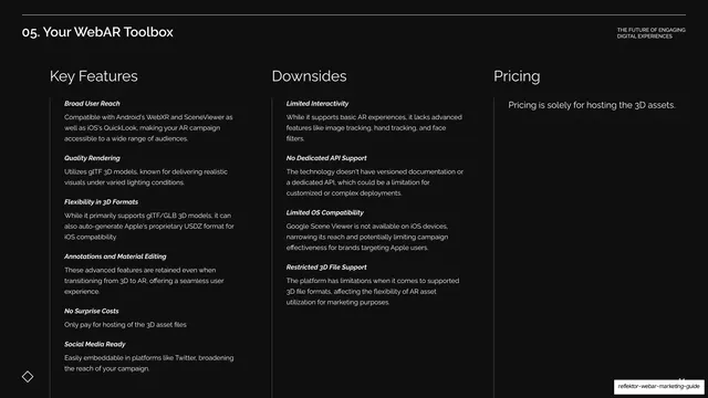
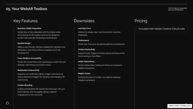
Dark three-column table comparing AR Quick Look's Key Features, Downsides, and Pricing with bold-italic sub-labels.
Summary
The AR Quick Look comparison table: three columns headed Key Features, Downsides, and Pricing, each a stack of bold-italic-labeled entries.
Visual description
Near-black background under the "05. Your WebAR Toolbox" header, no oversized title. Three columns headed "Key Features", "Downsides", and "Pricing" in white sans are divided by faint vertical hairlines. Key Features lists five bold-italic entries (iOS-Optimized, One-Tap AR Preview, Immersive Visuals, User-Friendly, Global iOS Reach); Downsides lists four (iOS Exclusivity, Content Limitation, File Format Restriction, No Advanced AR Features); Pricing reads "Pricing is solely for hosting the 3D assets." The diamond motif sits bottom-left.
Key takeaway
Consistency again: by the fourth time, the reader knows exactly where to look for features, drawbacks, and cost. That predictability is the deck's quiet strength for comparison content.
Reuse notes
Reuse as the standard breakdown after each spotlight. Keep the column heads and label styling identical across every tool so audiences can scan vertically and across.
From this deck: AR Quick Look features, downsides, pricing
View deck



More like this




Keep what you find
A free account saves references to boards and can send you a weekly email of picks based on what you save.
To see every result, go Pro.