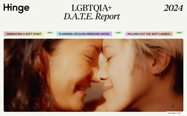
Preview image. Unlock full-res
A 57-page editorial dating-research report from Hinge that pairs a high-contrast serif with a geometric sans over soft pastel gradient blocks, a cream palette, and green-highlighter stat callouts.
Summary
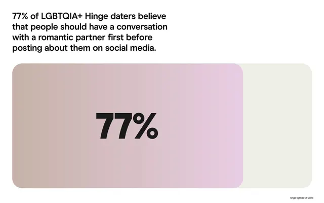
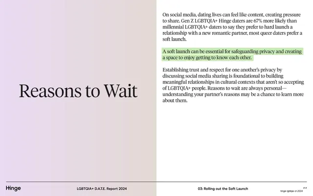
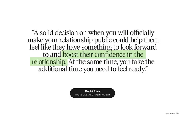
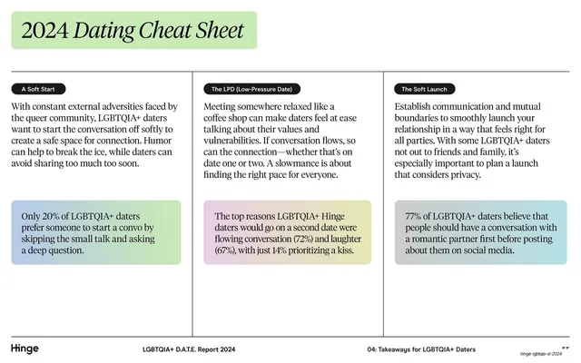
A 57-page consumer-research report from Hinge on LGBTQIA+ dating, structured around the concept of a "slowmance." Its design system rests on three moves: a high-contrast editorial serif paired with a clean geometric sans, soft multi-color pastel gradient blocks used as section cards and stat panels, and a green-highlighter treatment that marks the single key statistic inside each block of body copy.
Visual description
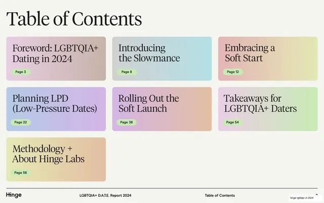
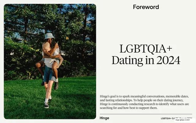
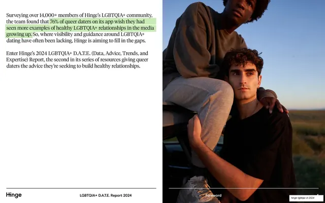
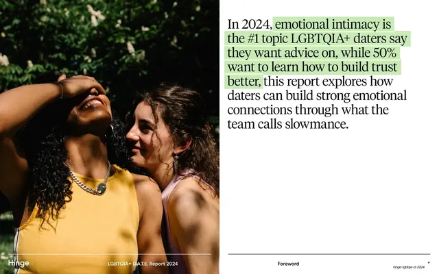
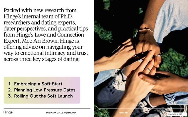
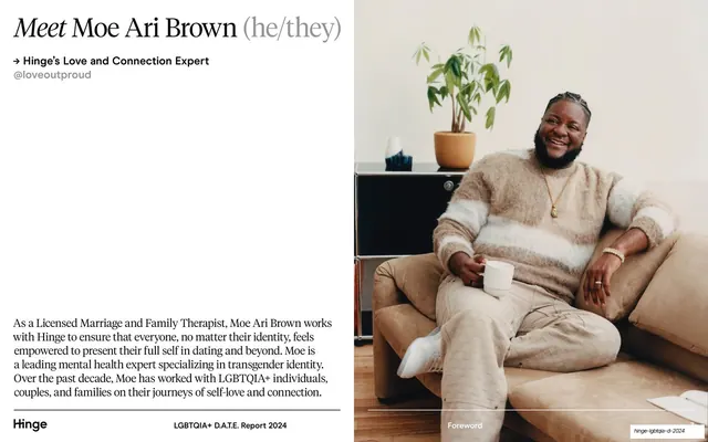
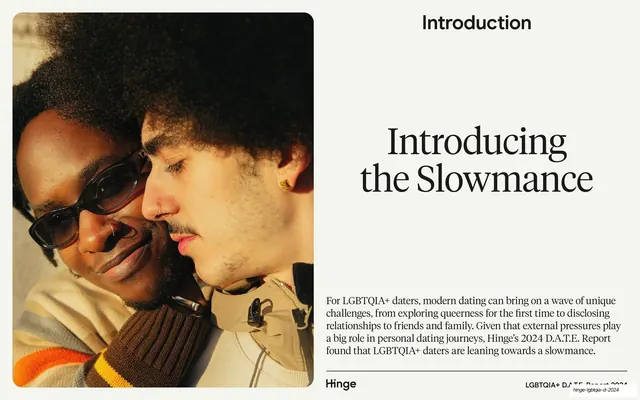
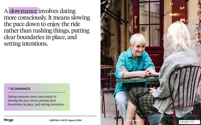
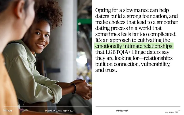
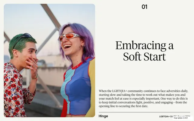
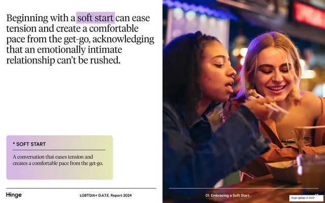
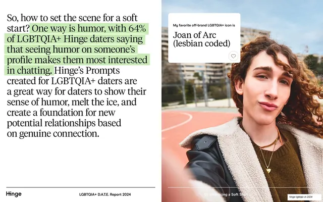
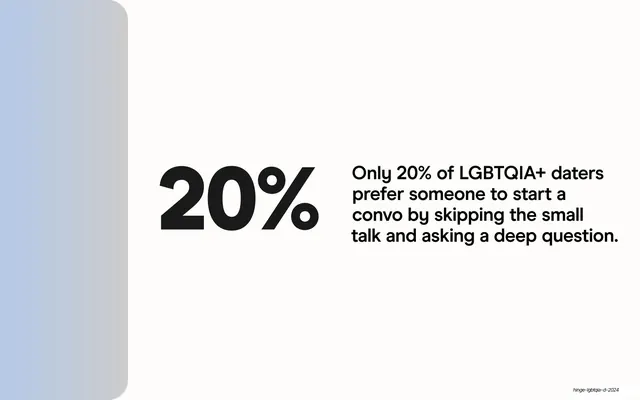
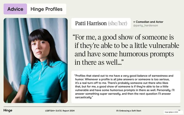
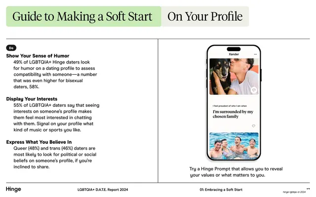
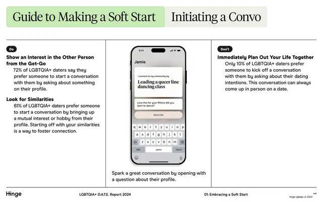
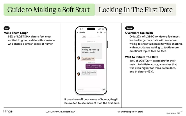
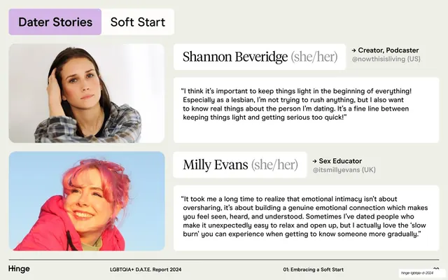
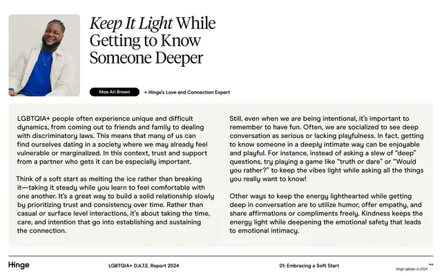
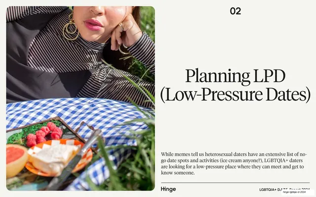
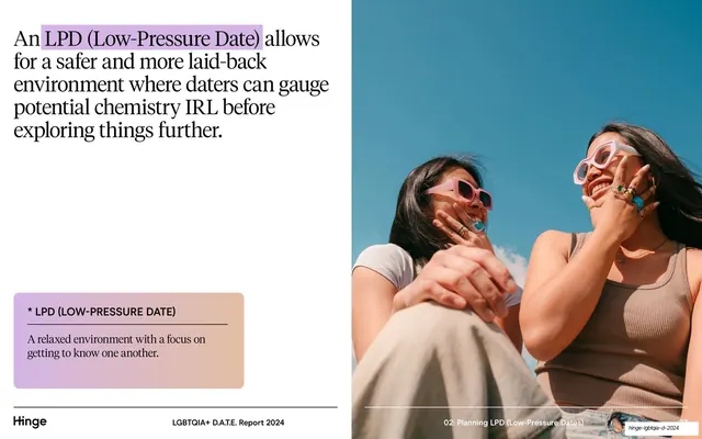
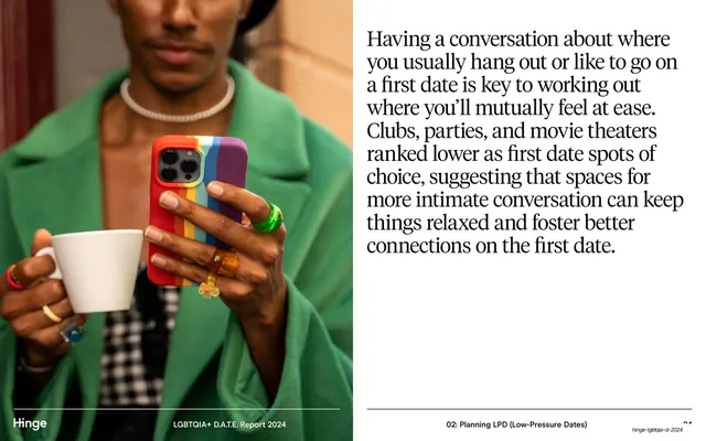
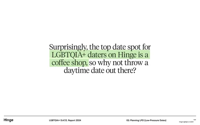
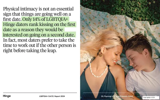
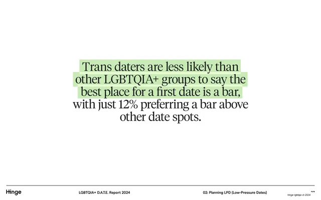
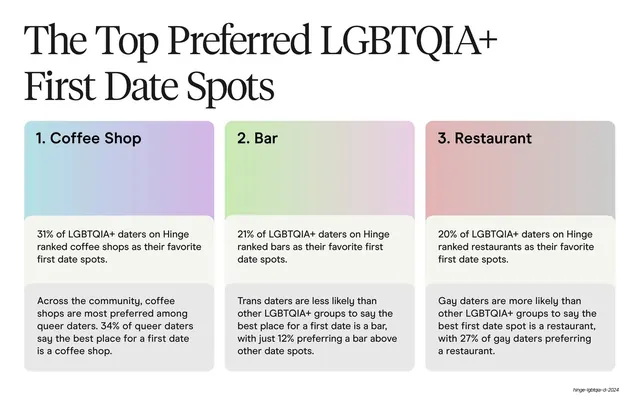
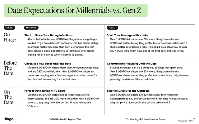
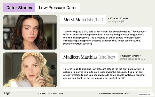
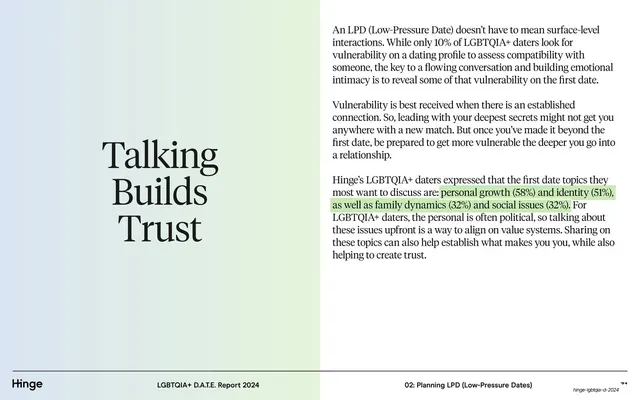
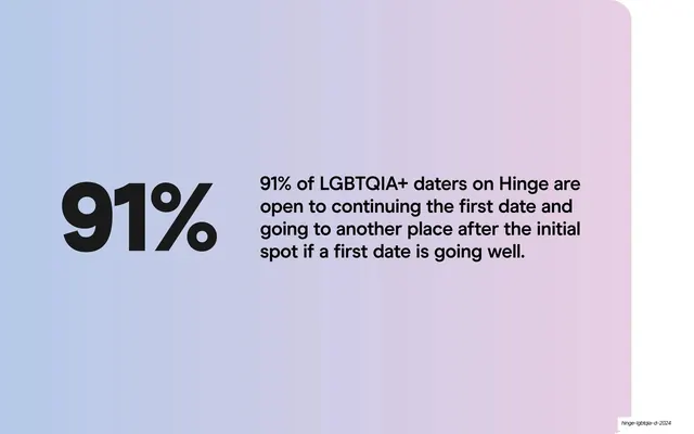
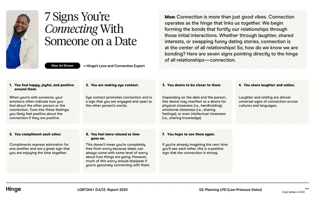
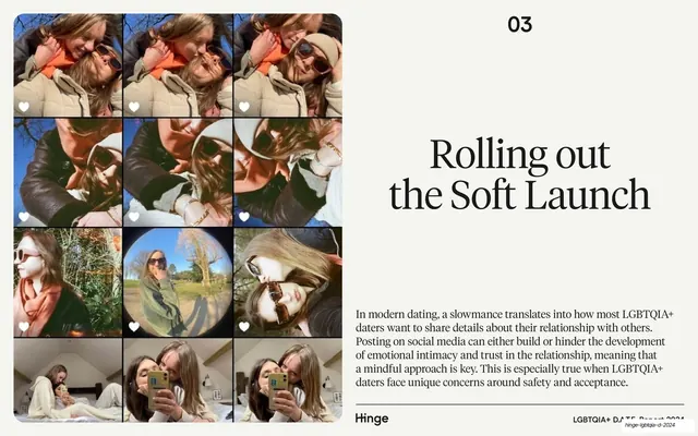
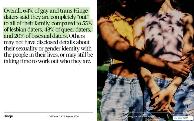
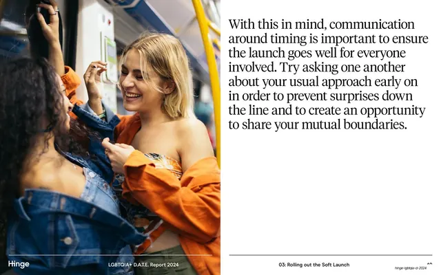
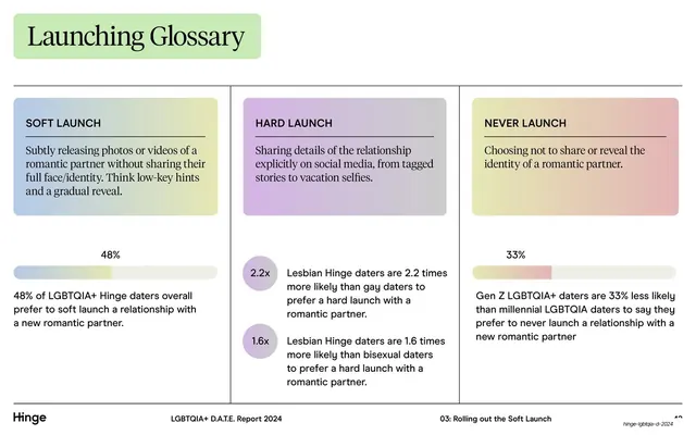
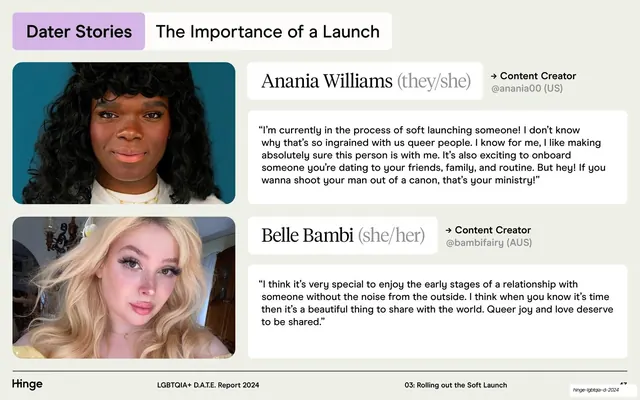
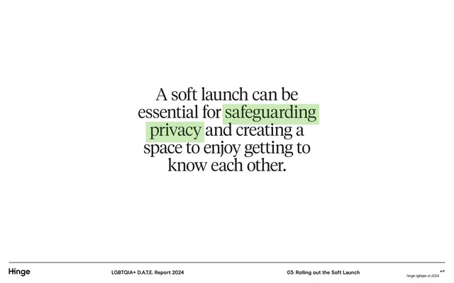
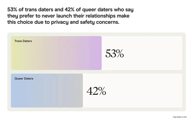
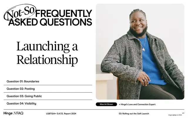
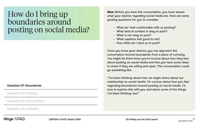
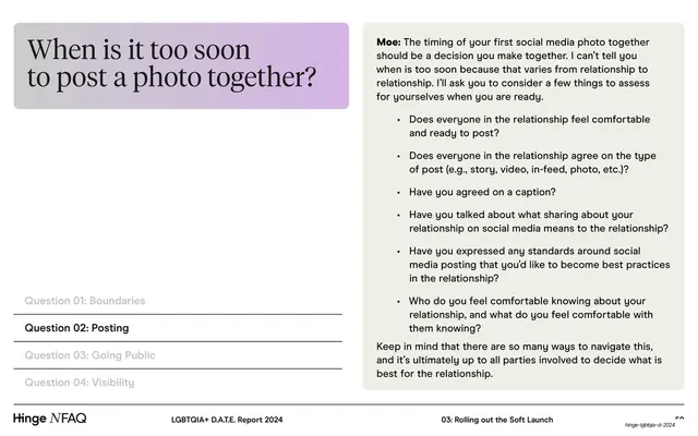
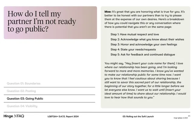
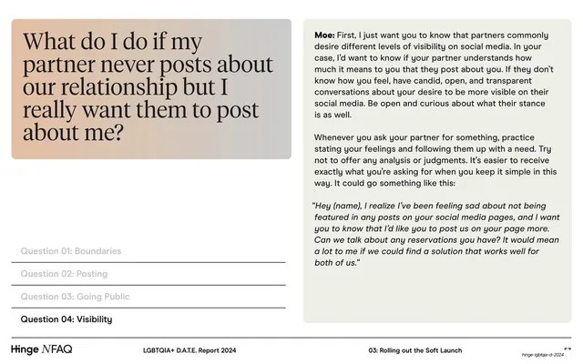
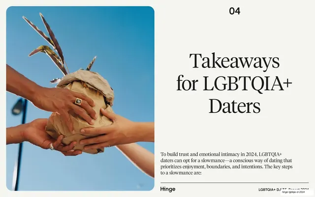
Pages run 16:9 on a warm cream (#F3F1E9) ground with near-black text. Two typefaces carry the whole report: a high-contrast serif (used for the cover title, section openers, and most body copy) and a geometric sans (used for oversized percentage stats, utility labels, captions, and the app-mockup UI). The signature color device is soft pastel gradient blocks in pink, blue, lavender, green and peach, appearing as the table-of-contents cards, as full-height stat panels behind giant sans-serif percentages, and as small rounded pill tabs and definition callouts. Statistics embedded in serif body copy are marked with a lime-green highlighter swipe. Recurring layouts: full-bleed or boxed editorial photography paired with a column of serif text (often split left-image / right-text and its mirror); two-up big-stat rows where an oversized percentage sits in a pastel block beside its explanation; pill-tab section headers (a colored tab plus a neutral tab); and app-mockup guide pages showing a Hinge phone screen beside Do/Don't advice columns. A consistent footer runs the Hinge wordmark left, "LGBTQIA+ D.A.T.E. Report 2024" centered, and the section name plus page number right, on a thin hairline rule. Photography is candid, warm, naturally lit, and features diverse LGBTQIA+ subjects.
Key takeaway
The pastel gradient block as a flexible system primitive: it is the same object whether it is a contents card, a stat backdrop, a section tab, or a definition box, which makes a long report feel coherent without rigid repetition. The green-highlighter swipe is a cheap, high-impact way to direct the eye to the one number that matters in a paragraph. And the disciplined serif-plus-sans pairing, serif for voice and editorial warmth, sans for data and UI, gives the report both authority and friendliness.
Reuse notes
A strong reference for data-driven brand reports, trend reports, and any long-form research deck that needs to stay warm and human rather than corporate. The split-image editorial spreads, big-stat blocks, and Do/Don't app-mockup pages are directly reusable templates. Depends on genuinely good candid photography and a real high-contrast serif to carry the editorial half; the pastel palette reads soft and inclusive but would need adjusting for a more austere or technical brand.
From this deck: Hinge LGBTQIA+ D.A.T.E. Report 2024
View deck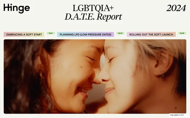

More like this

Keep what you find
A free account saves references to boards and can send you a weekly email of picks based on what you save.
To see every result, go Pro.