Preview image. Unlock full-res
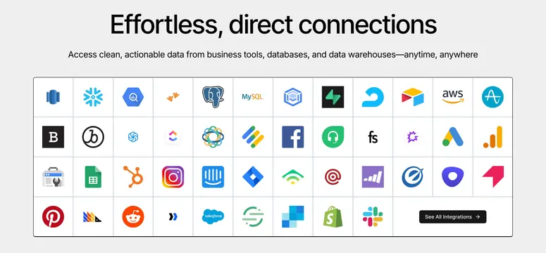
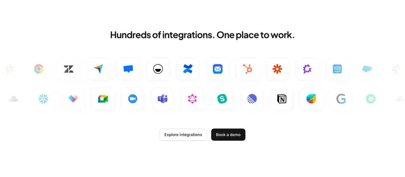
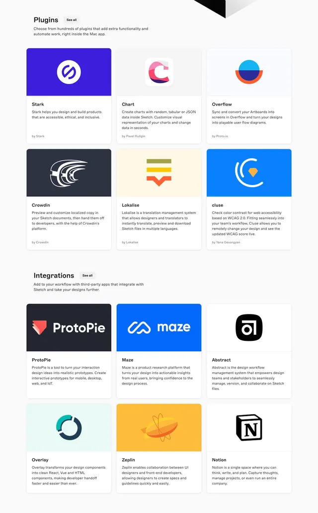
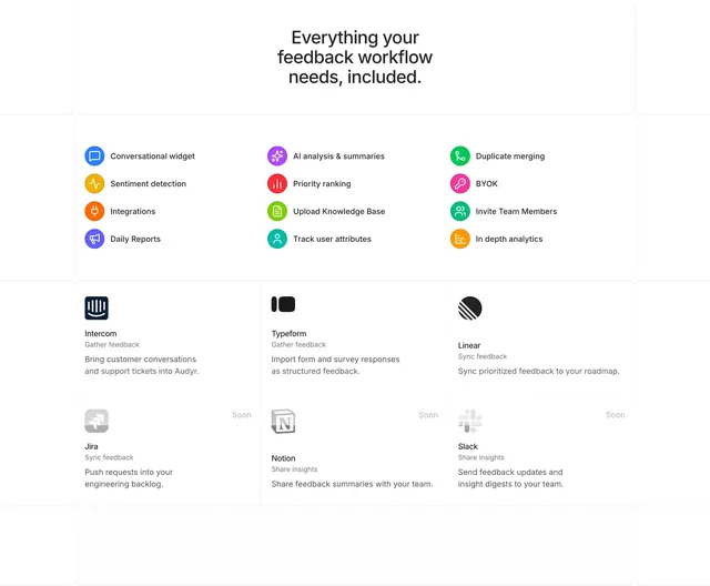
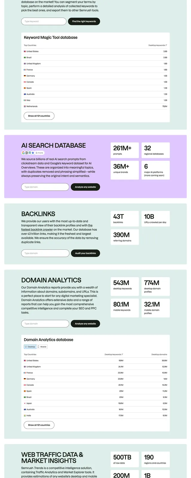
Centered integrations section with a headline over a bordered grid of full-color third-party app logos and a See All button.
Summary
A centered integrations section pairing an oversized headline and one-line subhead with a large bordered grid of recognizable full-color app and data-tool logos, capped by a dark See All Integrations button.
Visual description
On a light grey background, a big black headline ("Effortless, direct connections") centers over a single line of muted subcopy about connecting business tools, databases, and warehouses. Below sits a wide rounded panel with a hairline border, divided by thin gridlines into a dense matrix of logo cells (roughly twelve across, four rows). Each cell holds a single full-color brand mark (Snowflake, Postgres, MySQL, AWS, Facebook, HubSpot, Instagram, Jira, Salesforce, Shopify, Slack, Reddit, Pinterest and many more). The bottom-right cell is replaced by a dark "See All Integrations" button with an arrow.
Key takeaway
Keeping every logo in full color inside a tidy ruled grid signals breadth of integrations at a glance and feels alive versus flat greyscale strips. Swapping the last grid cell for the CTA keeps the layout perfectly aligned.
Reuse notes
Ideal for a data or platform product whose value is "connects to everything." Needs enough recognizable logos to impress; a sparse grid undercuts the message. The ruled-cell container keeps many mismatched marks looking orderly.
More integrations sections
See all











More like this


Keep what you find
A free account saves references to boards and can send you a weekly email of picks based on what you save.
To see every result, go Pro.