Preview image. Unlock full-res
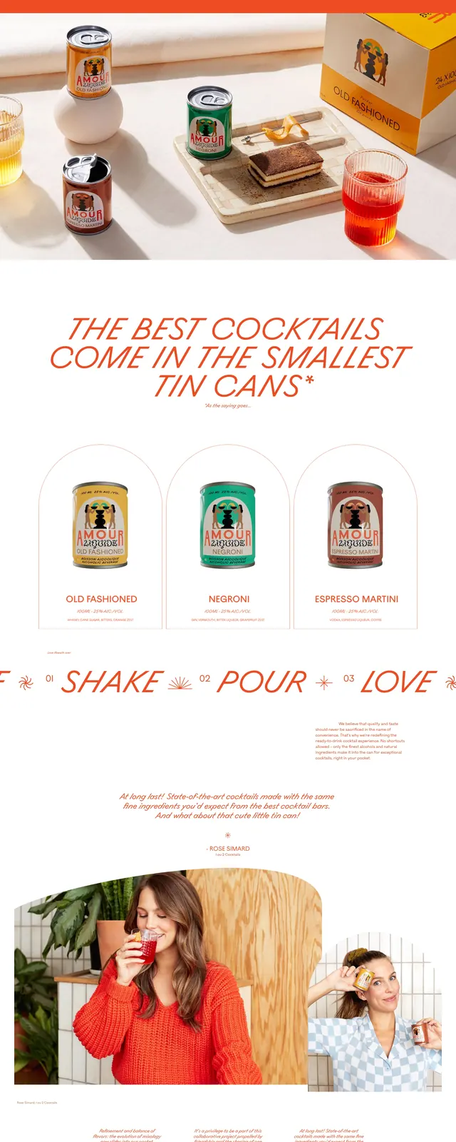
A vibrant, retro-inspired landing page for a pocket-sized cocktail brand featuring bold colors and playful typography.
Summary
A vibrant, retro-inspired landing page for a pocket-sized cocktail brand featuring bold colors and playful typography.
Visual description
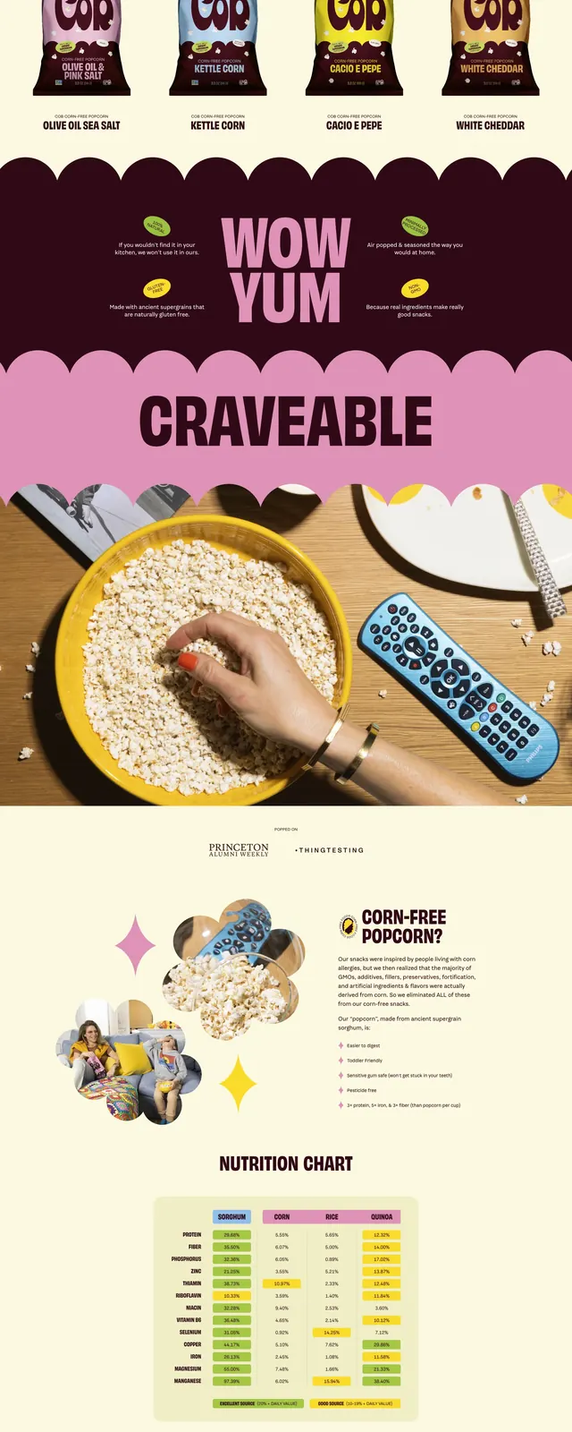
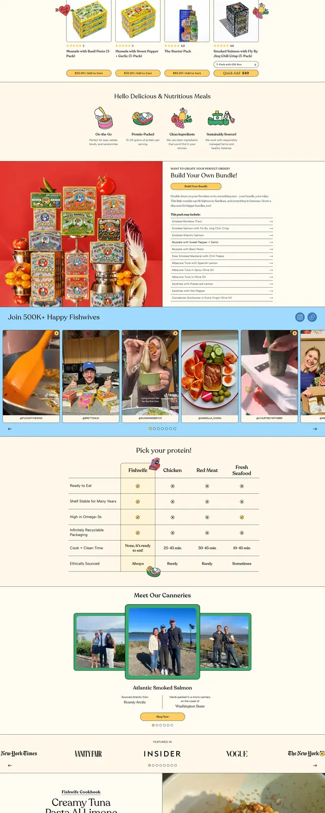
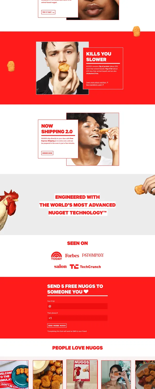
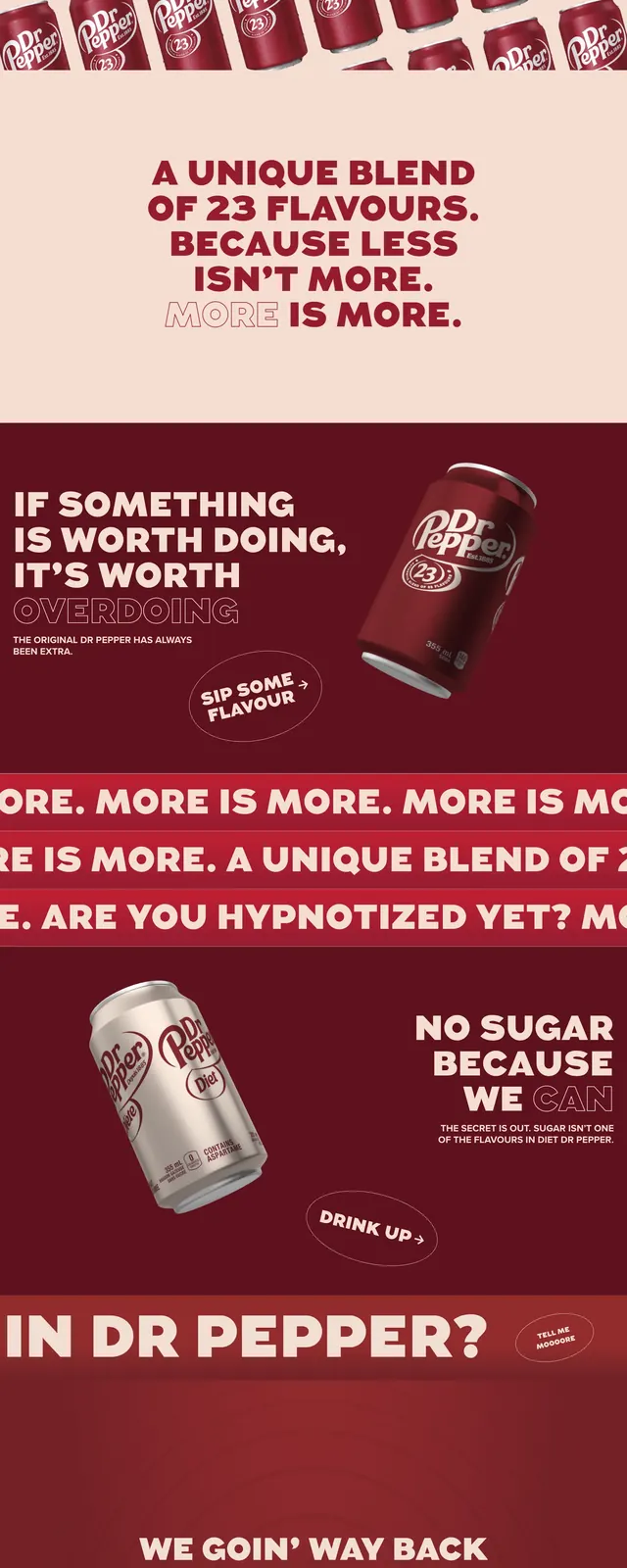
The page uses a high-contrast orange and white color palette with a split-screen hero section. Product shots of tin cans are presented in arched frames within a three-column grid. The footer features a bold, illustrative graphic and a clean list-style navigation menu.
Key takeaway
The use of oversized display typography and a limited, vibrant color palette creates a strong, memorable brand identity.
Reuse notes
Excellent example of using arched containers to break the grid and adding personality through custom illustrative elements.