Preview image. Unlock full-res
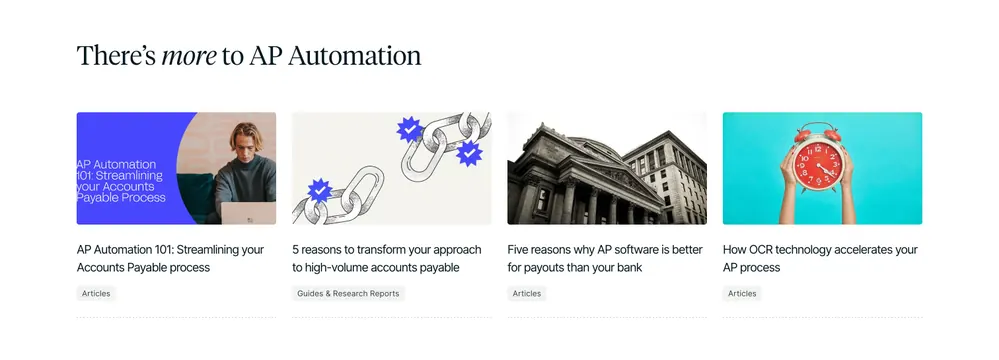
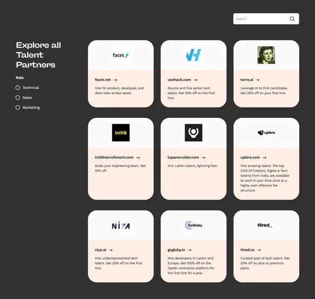
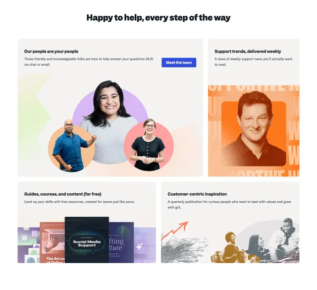
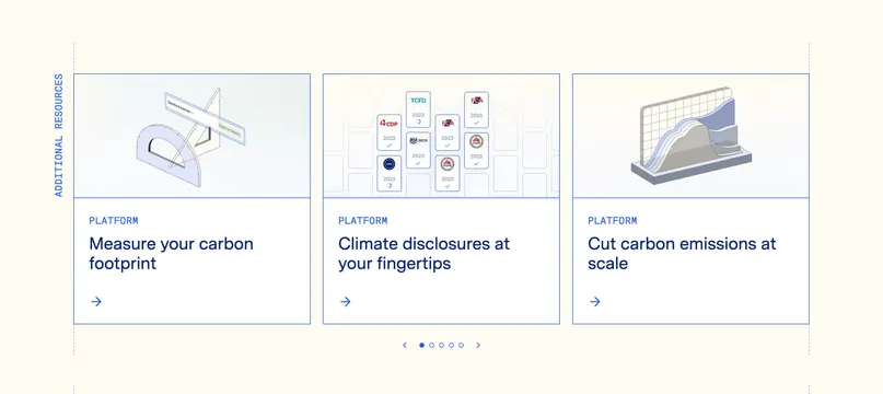
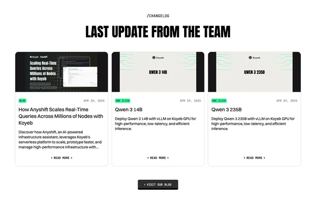
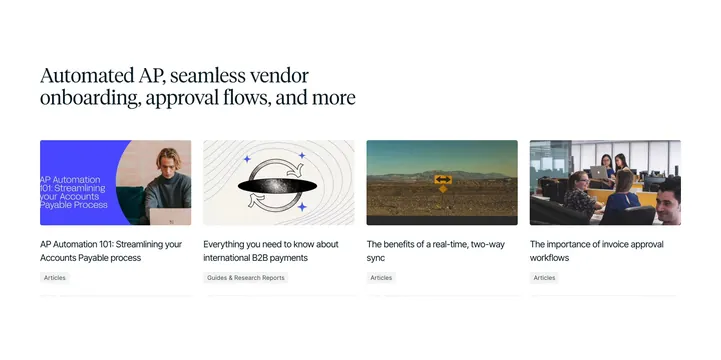
Light four-column resource row of blog cards, each with a thumbnail image, multi-line title, and category tag.
Summary
A light blog-resources row with a left-aligned serif headline above four article cards, each a rounded thumbnail over a two-line title and a category tag.
Visual description
On white, a left-aligned serif headline reads "There's more to AP Automation" with "more" set in serif italic. Below sit four equal article cards. Each leads with a rounded-corner thumbnail: a purple-and-photo AP Automation 101 graphic, an illustrated chain-link image with blue burst badges, a black-and-white classical bank building, and a teal photo of hands holding a red alarm clock. Under each thumbnail is a two-line dark serif/sans title (AP Automation 101, 5 reasons to transform your approach, Five reasons why AP software is better, How OCR technology accelerates your AP process) and a small grey category tag chip ("Articles" or "Guides & Research Reports"). A faint dotted rule runs under each card.
Key takeaway
The clean four-up article grid where varied thumbnail treatments (product graphic, illustration, photo) keep the row lively, and a small category chip under each title aids scanning. The serif headline with one italic word adds editorial polish.
Reuse notes
A dependable "latest articles / resources" footer-adjacent block for content-heavy B2B sites. Works on light backgrounds and scales from three to four cards. Needs consistent thumbnail aspect ratios; the category chips help when content types are mixed. Keep titles to two lines for even card heights.
More resources sections
See all
More like this

Keep what you find
A free account saves references to boards and can send you a weekly email of picks based on what you save.
To see every result, go Pro.