Preview image. Unlock full-res
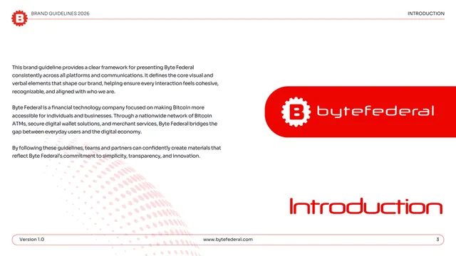
Introduction page pairing three paragraphs of brand copy on the left with the logo locked up inside a large red rounded panel on the right.
Summary
The introduction: a left column of brand-positioning copy facing a large red rounded panel that holds the white logo, framed by the running header and footer.
Visual description
White page, standard red-ruled header reading "INTRODUCTION." The left half carries three short paragraphs in dark gray Sora explaining that the guideline provides a consistent framework, that Byte Federal is a fintech company making Bitcoin accessible through ATMs, wallets, and merchant services, and that following the rules keeps materials cohesive. The right half is dominated by a large red rounded-rectangle panel containing the gear-B icon and "bytefederal" wordmark reversed in white. A faint pink halftone sphere sits behind the lower-left text. The lower right shows "Introduction" large in red display type; the pill footer holds version, URL, and page "3."
Key takeaway
Floating the logo in a generous red rounded panel turns a plain intro into a brand statement and previews the primary color immediately. The disciplined left-text / right-brand-block split is an easy, repeatable opener for any about page.
Reuse notes
Good as the first content page of a guideline or company profile where the brand color and logo should land before any rules. Keep the copy to three tight paragraphs so the colored panel stays the focal point.
From this deck: Byte Federal introduction
View deck













More like this








Keep what you find
A free account saves references to boards and can send you a weekly email of picks based on what you save.
To see every result, go Pro.