Preview image. Unlock full-res
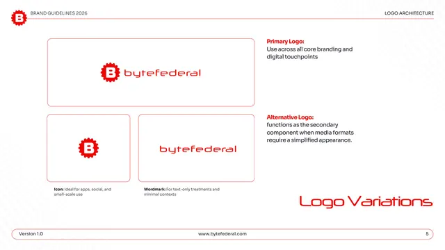
Logo variations page showing the primary lockup, icon, and wordmark in red-outlined cards with usage notes for each.
Summary
The logo variations: three red-outlined cards presenting the primary horizontal lockup, the standalone gear-B icon, and the wordmark, each annotated with where to use it.
Visual description
White page under the "LOGO ARCHITECTURE" header. A large rounded card top-left holds the primary logo (red gear-B icon plus "bytefederal" wordmark). Below it, two smaller cards show the icon alone and the wordmark alone. To the right, red bold labels with gray notes: "Primary Logo: Use across all core branding and digital touchpoints" and "Alternative Logo: functions as the secondary component when media formats require a simplified appearance." Captions under the small cards read "Icon: Ideal for apps, social, and small-scale use" and "Wordmark: For text-only treatments and minimal contexts." A faint halftone sphere sits lower left; "Logo Variations" appears large in red display type lower right; the pill footer shows page "5."
Key takeaway
Showing primary, icon, and wordmark in consistently styled outlined cards with a one-line use-case each makes the logo system instantly scannable. Pairing every mark with its context ("apps and social," "text-only") preempts misuse without long copy.
Reuse notes
A clean default for the logo-variations page of any identity guide. The red keyline cards read well on white and could be recolored per brand. Reach for it whenever a brand ships more than one lockup and needs to delineate when each applies.
From this deck: Byte Federal logo variations
View deck
More like this
Keep what you find
A free account saves references to boards and can send you a weekly email of picks based on what you save.
To see every result, go Pro.