Preview image. Unlock full-res
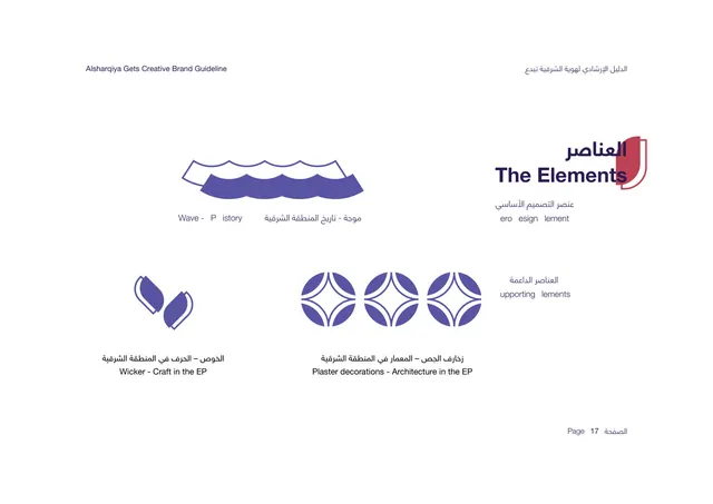
Full-bleed periwinkle section divider for The Logo chapter, with red wave motif bleeding off the left edge.
Summary
The chapter divider introducing "The Logo," a full-bleed periwinkle field with the red wave motif on the left and a bilingual title.
Visual description
Solid periwinkle-blue background filling the whole page. Two rows of the signature wave shape sit on the left edge, rendered in brick red as solid forms with thin red outline echoes, bleeding off the left margin. The bilingual title sits low-left over the waves: a large Arabic display word on top and "The Logo" in heavy white sans below. The right two-thirds is empty color. No body copy, no page number.
Key takeaway
Pure color plus motif as a chapter break, with zero explanatory text. Recoloring the same wave shape (here red on periwinkle) per divider lets each section feel distinct while staying systematic.
Reuse notes
Use as a section opener inside a longer deck to give the reader a clear visual pause. The formula is reusable: pick a brand color for the field, restate the motif on one edge, drop the bilingual title low. Only works when the motif is recognizable enough to carry an otherwise empty page.