Preview image. Unlock full-res
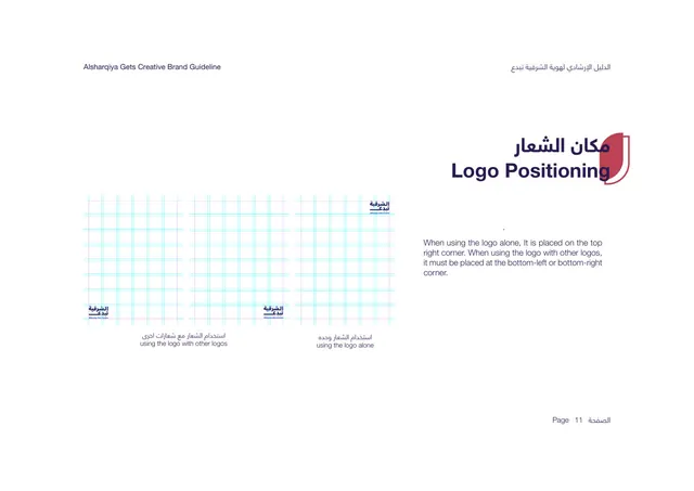
Positioning page showing grid layouts for placing the logo alone top-right versus bottom corners alongside other logos.
Summary
The placement rule: layout-grid diagrams showing the logo positioned top-right when alone and bottom-left or bottom-right when sharing space with other logos.
Visual description
White background. The bilingual title "Logo Positioning" sits upper-right in deep purple over the red shield tab. The left area shows three layout artboards overlaid with cyan and pink modular grids: two demonstrate the logo placed in a bottom corner (captioned "using the logo with other logos") and one shows the logo in the top-right corner (captioned "using the logo alone"). The right side holds a short paragraph stating the logo goes top-right when alone and bottom-left or bottom-right when used with other logos. Bilingual captions sit under the diagrams. "Page 11" bottom-right.
Key takeaway
Showing placement against a visible layout grid grounds the rule in a real composition system rather than an abstract instruction. Separating the alone case from the co-branding case with their own diagrams prevents ambiguity.
Reuse notes
A useful template for any identity that anticipates co-branding or partner lockups. The grid-overlay artboards communicate placement precisely; reuse them whenever a logo needs a defined home on a page. Good companion to the clear-space page.
From this deck: Logo Positioning
View deck



More like this






Keep what you find
A free account saves references to boards and can send you a weekly email of picks based on what you save.
To see every result, go Pro.