Preview image. Unlock full-res
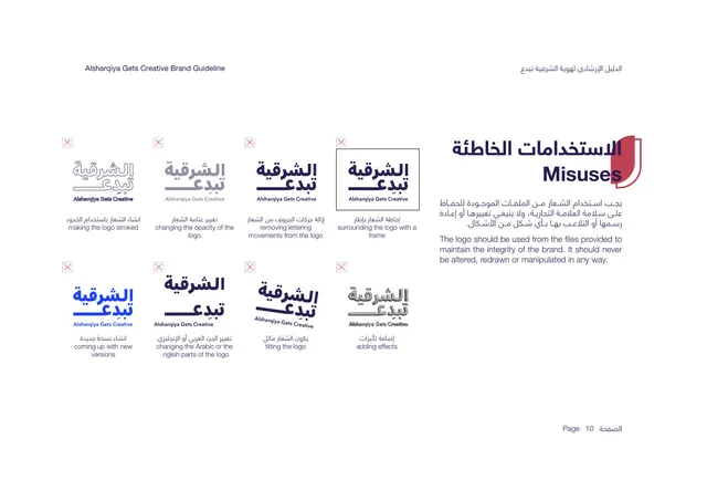
Misuse page showing eight incorrect logo treatments, each marked with a red X and a bilingual caption.
Summary
The misuse page: eight don't examples of the logo, each topped with a small red X box and a bilingual caption naming the violation.
Visual description
White background. The bilingual title "Misuses" sits upper-right in deep purple over the red shield tab, with a short justified paragraph stating the logo should never be altered, redrawn, or manipulated. The left two-thirds is a four-column, two-row grid of eight wrong-usage thumbnails, each marked with a small red outlined X in the top-left corner. Captions (bilingual) call out: making the logo stroked, changing opacity, removing lettering movements, surrounding with a frame, coming up with new versions, changing the Arabic or English parts, tilting the logo, and adding effects. "Page 10" bottom-right.
Key takeaway
A dense eight-up don't grid with a consistent red-X marker covers the common abuses efficiently in one page. Each thumbnail actually shows the wrong result rather than describing it, which is more memorable.
Reuse notes
The definitive misuse page format; reuse the X-marked thumbnail grid for any logo. Pairing each visual with a one-line caption in both languages makes the rule unambiguous. Keep the X marker color distinct from the brand palette so it reads as a warning.
From this deck: Logo Misuses
View deck

More like this






Keep what you find
A free account saves references to boards and can send you a weekly email of picks based on what you save.
To see every result, go Pro.