Preview image. Unlock full-res
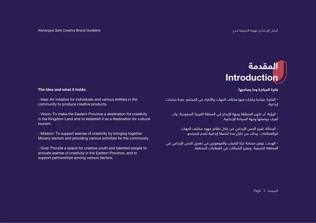
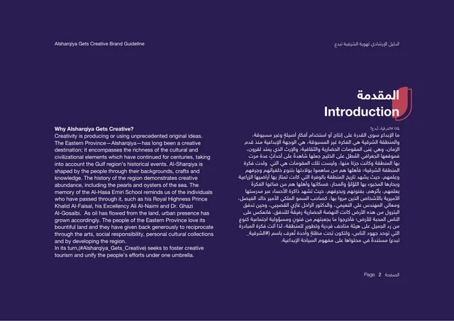
Introduction page with a red section tab and two columns of bilingual body copy explaining why the initiative exists.
Summary
The introduction page, answering "Why Alsharqiya Gets Creative" with a block of bilingual body copy on a deep purple ground.
Visual description
Deep indigo-purple background. The section title "Introduction" sits upper-right in white and red, overlapping a red shield tab; the Arabic equivalent runs above it in red. Two columns of small running-header text sit at the very top. The body is split: an English paragraph left, an Arabic paragraph right, each a dense single block of small light-weight type. The copy explains the Eastern Province as a long-standing creative destination rooted in Gulf culture, pearls, and oyster heritage, and frames the initiative as fostering creative tourism under one umbrella. Large empty margins surround the text. A small "Page 2" marker sits bottom-center-right.
Key takeaway
The red shield tab behind the section title is a consistent wayfinding device that recurs through the deck. Mirroring English and Arabic as two equal columns keeps both languages first-class rather than one being a caption.
Reuse notes
A clean template for a text-heavy introduction or about page in a bilingual deck. The dark ground with light type reads as serious and editorial. Best paired with the matching divider and content pages that reuse the same red-tab title treatment.