Preview image. Unlock full-res
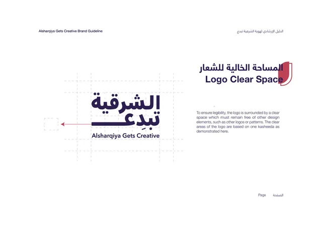
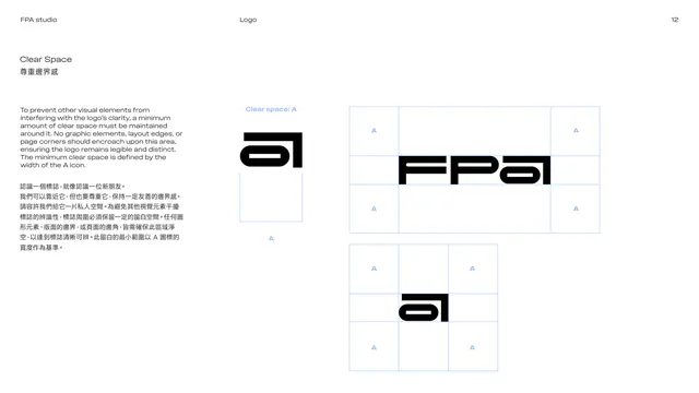
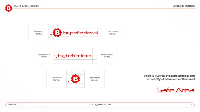
Clear-space page showing the wordmark on a construction grid with a kasheeda-based minimum exclusion zone.
Summary
The clear-space rule: the logo on a dashed construction grid, with the minimum surrounding clear area defined by one kasheeda unit.
Visual description
White background. The bilingual title "Logo Clear Space" sits upper-right in deep purple over the red shield tab. The left half shows the deep-purple bilingual wordmark sitting inside a light dashed grid; a small dashed square at the left with a thin red arrow points toward the logo, marking the one-kasheeda spacing unit used to set the exclusion zone. The right half holds a short justified paragraph explaining that the logo must keep a clear space free of other elements, sized to one kasheeda as demonstrated. Open margins; a faint "Page" marker bottom-right.
Key takeaway
Tying the clear-space measurement to a brand-specific unit (the kasheeda) rather than a generic letter makes the rule feel native to this identity. The single red arrow plus one dashed square communicates the whole rule without clutter.
Reuse notes
The canonical clear-space page; reuse the dashed-grid plus arrow convention for any logo. Defining the exclusion zone from a meaningful element of the mark is a nice touch worth borrowing. Keep the grid faint so the logo stays the subject.
From this deck: Logo Clear Space
View deck







More like this



Keep what you find
A free account saves references to boards and can send you a weekly email of picks based on what you save.
To see every result, go Pro.