Preview image. Unlock full-res
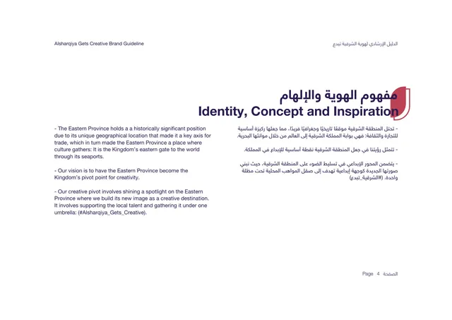
Concept page explaining the Eastern Province inspiration behind the identity, set as bilingual body copy on white.
Summary
The concept rationale: how the Eastern Province's history as the Kingdom's eastern gate inspires the identity, written as bilingual body copy.
Visual description
First content page to flip to a white background. The bilingual title "Identity, Concept and Inspiration" sits upper-right in deep purple with the red shield tab behind it and the Arabic equivalent above. Body copy is split into two columns: English left in dark purple sans, Arabic right-aligned right. The text frames the Eastern Province as historically and geographically significant, the Kingdom's eastern gate through its seaports, and positions the creative pivot under the hashtag-style line "#Alsharqiya_Gets_Creative." Three short dash-led paragraphs per side, with wide white margins and "Page 4" bottom-right.
Key takeaway
Switching the ground from dark to white between the brand-story pages and the concept page signals a shift in section without changing the layout grammar. The title treatment stays identical so the chapter system still reads.
Reuse notes
Good model for a concept or inspiration page that needs to read as approachable and document-like rather than dramatic. The white ground makes dense bilingual copy easier on the eye than the dark intro pages. Pairs directly with the dark section dividers around it.
From this deck: Identity, Concept and Inspiration
View deck




More like this

Keep what you find
A free account saves references to boards and can send you a weekly email of picks based on what you save.
To see every result, go Pro.