Preview image. Unlock full-res
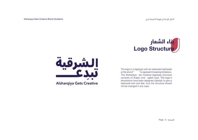
Logo structure page showing the bilingual wordmark with its extended kasheeda alongside a bilingual explanation.
Summary
The logo structure page: the full bilingual wordmark shown large on the left, with text explaining the extended kasheeda that represents breaking limitations.
Visual description
White background. The bilingual title "Logo Structure" sits upper-right in deep purple over the red shield tab. The left half shows the primary logo at large size: a deep-purple Arabic logotype stacked over the English line "Alsharqiya Gets Creative," with a long horizontal kasheeda stroke extending from the final Arabic letter. The right half holds a short justified English paragraph explaining that the logo is a logotype with an extended kasheeda at the end to represent breaking limitations, that it combines Arabic and English type, and that its proportions should not be changed. "Page 6" bottom-right.
Key takeaway
Presenting the wordmark at large scale on one side and reserving the opposite side for a single tight rationale paragraph keeps the focus on the mark itself. The extended kasheeda is the signature gesture and the page makes it the visual hero.
Reuse notes
A standard logo-anatomy layout that adapts well to any wordmark with a distinctive flourish. The big-logo-left, explanation-right split is a safe default for the first logo page in a guideline. Especially relevant for Arabic or bilingual marks where the kasheeda is a design feature.
From this deck: Logo Structure
View deck
More like this





Keep what you find
A free account saves references to boards and can send you a weekly email of picks based on what you save.
To see every result, go Pro.