
Preview image. Unlock full-res
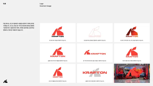
Prohibited usage page with eight don't cards covering orientation, color, gradients, outline, distortion, structure, effects, and scale.
Summary
The prohibited usage page: eight cards, each topped by a circled X, demonstrate a specific logo misuse to avoid.
Visual description
White page under "LOGO ARCHITECTURE." Eight red-outlined cards are arranged in rows, each marked with a black circled-X badge at the top edge and a caption: don't change the orientation, don't use other colors that are not given (purple example), don't apply any gradients, don't present the logo in outline or add a keyline, don't distort the logo in any way, don't change structure of the logo and use only what is given, don't apply shadows or other effects, and don't scale the logo too small. A right-hand gray note explains the restrictions protect the logo's recognizability and a cohesive brand identity. "Prohibited Usage" is set large in red display type lower right; the pill footer shows page "13."
Key takeaway
Eight consistently styled don't cards, each showing the exact wrong result with a circled-X and a short caption, is the clearest possible misuse page. Covering the full range (orientation, color, gradient, outline, distortion, structure, effects, scale) makes the rules feel complete.
Reuse notes
A definitive template for the "logo don'ts" page of any guideline. The circled-X plus rendered failure plus one-line caption pattern scales to as many cases as needed. Pairs with the approved logo pages earlier in the chapter.
From this deck: Byte Federal prohibited logo usage
View deck









More like this





Keep what you find
A free account saves references to boards and can send you a weekly email of picks based on what you save.
To see every result, go Pro.