Preview image. Unlock full-res
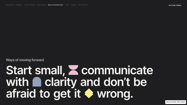
Dark section divider with a small gray "Challenges" label above a giant cream question headline studded with inline colored glyphs.
Summary
A near-black section break introducing "Challenges" with a giant four-line question headline broken up by small colored glyphs.
Visual description
Near-black (#1A1A1A) full bleed. The section-tab nav runs along the top with "Challenges" now bold-active, and the "BEYOND TRENDS" wordmark sits top-right. A small gray "Challenges" label marks the section, and below it a giant cream sentence-case headline fills the lower two-thirds: "How might we move from what is now outdated and drive meaningful impact through business?" Four inline glyphs are dropped between words across the lines: a coral half-circle, a yellow blob, a blue arch, and a dark-gray flower shape.
Key takeaway
Using a section divider to pose the section's central question at maximum size, with colored glyphs as the only ornament, so the break reads as both a pause and a thesis. The dark background makes the transition unmistakable against the cream content slides.
Reuse notes
A reusable section-break pattern for long reports and decks: small label, oversized question, sparse inline accents. Pairs with cream content slides for a clear dark/light rhythm. Needs the accent-glyph set defined to look deliberate rather than decorative.