Preview image. Unlock full-res
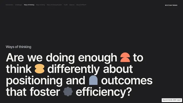
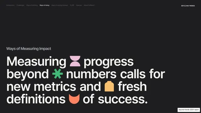
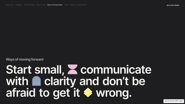
Dark section divider with a small gray "Ways of Measuring Impact" label above a giant cream headline studded with inline colored glyphs.
Summary
A near-black subsection break, "Ways of Measuring Impact", with a giant four-line headline studded with colored glyphs.
Visual description
Near-black (#1A1A1A) full bleed, persistent nav (Ways of doing active), "BEYOND TRENDS" top-right. A small gray "Ways of Measuring Impact" label sits above a giant cream sentence-case headline: "Measuring progress beyond numbers calls for new metrics and fresh definitions of success." Inline glyphs are dropped between words: a pink hourglass shape, a green asterisk, a yellow tag, and a coral half-circle.
Key takeaway
The second Ways of doing subsection divider, again rotating the glyph set against the constant dark headline. The pink hourglass introduces a new shape into the accent vocabulary while staying within the same flat playful style.
Reuse notes
Reuse as a nested subsection break, matched in scale and treatment to the other dividers. A small new glyph per divider keeps the repeated pattern from feeling mechanical. Keep the gray label style consistent across all section breaks.