Preview image. Unlock full-res
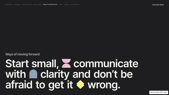
Dark subsection divider with a small gray "Ways of moving forward" label above a giant cream headline studded with inline colored glyphs.
Summary
A near-black subsection break under Ways of moving forward, with a giant three-line headline studded with colored glyphs.
Visual description
Near-black (#1A1A1A) full bleed, persistent nav ("Ways of moving forward" active), "BEYOND TRENDS" top-right. A small gray "Ways of moving forward" label sits above a giant cream sentence-case headline: "Start small, communicate with clarity and don't be afraid to get it wrong." Inline glyphs are dropped between words: a pink hourglass, a blue arch, and a yellow diamond.
Key takeaway
The same divider grammar opening the actionable subsection of the final pillar, reinforcing that every break in the report looks identical: dark ground, oversized headline, a few inline glyphs. The repetition makes the structure feel inevitable.
Reuse notes
Reuse as a subsection break inside a section. Keeping the divider treatment fixed while rotating only the glyph mix is the whole pattern. Align scale and label style with the other dividers.