Preview image. Unlock full-res
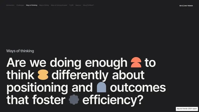
Dark section divider with a small gray "Ways of Accountable Positioning" label above a giant cream headline studded with inline colored glyphs.
Summary
A near-black subsection break, "Ways of Accountable Positioning", with a giant four-line headline studded with colored glyphs.
Visual description
Near-black (#1A1A1A) full bleed, persistent nav (Ways of doing active), "BEYOND TRENDS" top-right. A small gray "Ways of Accountable Positioning" label sits above a giant cream sentence-case headline: "Simple shifts in process and prioritisation can accelerate impact, profit and drive innovation." Inline glyphs are dropped between words: a yellow tag/lozenge, a blue crescent, a green asterisk, and a yellow diamond.
Key takeaway
The divider system reused for a named subsection (one of the three challenge themes), keeping the dark ground and oversized headline but swapping in a fresh combination of accent glyphs. It signals "new subsection" while staying visually part of the Ways of doing run.
Reuse notes
Reuse for nested subsection breaks inside a larger section. Rotating which glyphs appear keeps repeated dividers feeling fresh without redesigning them. Match headline scale to the top-level dividers.