Preview image. Unlock full-res
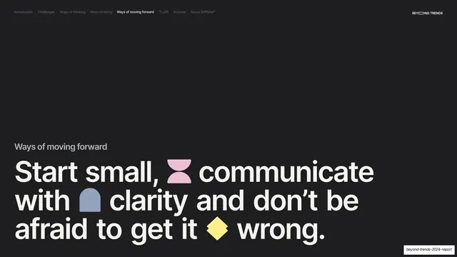
Dark section divider with a small gray "Ways of moving forward" label above a giant cream headline studded with inline colored glyphs.
Summary
A near-black section break opening "Ways of moving forward" with a giant three-line headline studded with colored glyphs.
Visual description
Near-black (#1A1A1A) full bleed, persistent nav ("Ways of moving forward" bold-active), "BEYOND TRENDS" top-right. A small gray "Ways of moving forward" label sits above a giant cream sentence-case headline: "Start small, communicate with clarity and don't be afraid to get it wrong." Inline glyphs are dropped between words: a pink hourglass, a blue arch, and a yellow diamond.
Key takeaway
The top-level section divider for the report's final pillar, matched to the earlier dividers in dark ground, oversized headline and inline glyphs, so the reader instantly recognizes another major section opening.
Reuse notes
Reuse as a primary section break. The consistent dark, big-type, glyph-studded treatment across all dividers is what makes the report navigable. Keep the gray label and headline scale aligned with the rest of the set.