Preview image. Unlock full-res
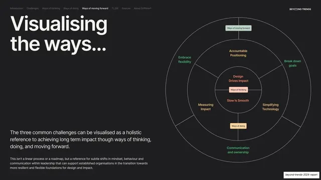
Dark slide pairing a "Visualising the ways..." headline and intro left with a large concentric radial framework diagram of the report's themes on the right.
Summary
The synthesis slide: a "Visualising the ways..." headline and short intro on the left, paired with a large concentric radial diagram on the right that maps the report's three layers of themes.
Visual description
Near-black (#1A1A1A) full bleed, persistent nav ("Ways of moving forward" active), "BEYOND TRENDS" top-right. The left holds a large cream two-line headline, "Visualising the ways...", with a lead paragraph and a smaller note beneath. The right half is a thin-lined concentric-circle diagram: three nested rings divided into radial segments. The innermost ring (pink/coral labels) reads "Design Drives Impact", "Slow Is Smooth" with a "Ways of thinking" chip; the middle ring (orange labels) holds "Accountable Positioning", "Measuring Impact", "Simplifying Technology" around a "Ways of doing" chip; the outer ring (green labels) holds "Embrace flexibility", "Break down goals", "Communication and ownership" with a "Ways of moving forward" chip at top. Labels are color-coded to each layer.
Key takeaway
Compressing the whole report into one concentric, color-coded system map: each ring is a pillar, each segment a theme, with small chips naming the three "ways". It gives readers a single mental model and pays off the framework the deck has been building toward.
Reuse notes
A strong summary/synthesis device for any report or strategy deck with a layered framework. The radial concentric form works when themes nest into tiers; color-code labels to the tier they belong to. Best on a dark slide so the thin line work reads cleanly. Keep label counts low per ring so it stays legible.
From this deck: Visualising the ways framework diagram
View deck

More like this









Keep what you find
A free account saves references to boards and can send you a weekly email of picks based on what you save.
To see every result, go Pro.