Preview image. Unlock full-res
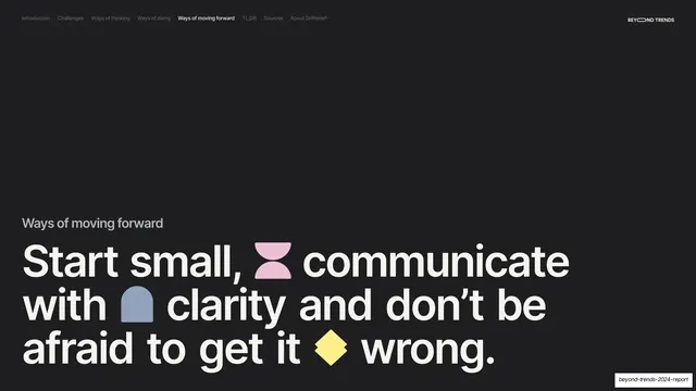
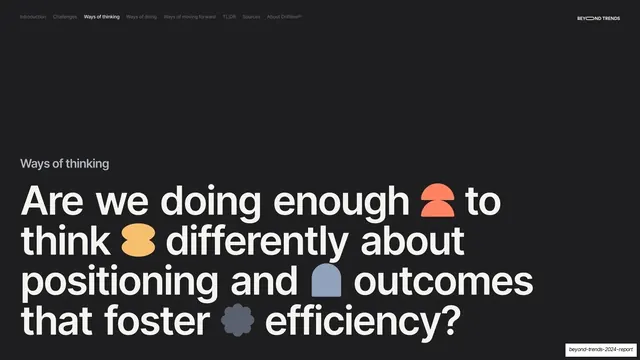
Dark section divider with a small gray "Ways of thinking" label above a giant cream question headline studded with inline colored glyphs.
Summary
A near-black section break opening "Ways of thinking" with a giant four-line question headline broken up by small colored glyphs.
Visual description
Near-black (#1A1A1A) full bleed. The section-tab nav runs along the top with "Ways of thinking" bold-active, "BEYOND TRENDS" top-right. A small gray "Ways of thinking" label sits above a giant cream sentence-case headline filling the lower area: "Are we doing enough to think differently about positioning and outcomes that foster efficiency?" Four inline glyphs are dropped between words: a coral half-circle, a yellow blob, a blue arch, and a gray flower.
Key takeaway
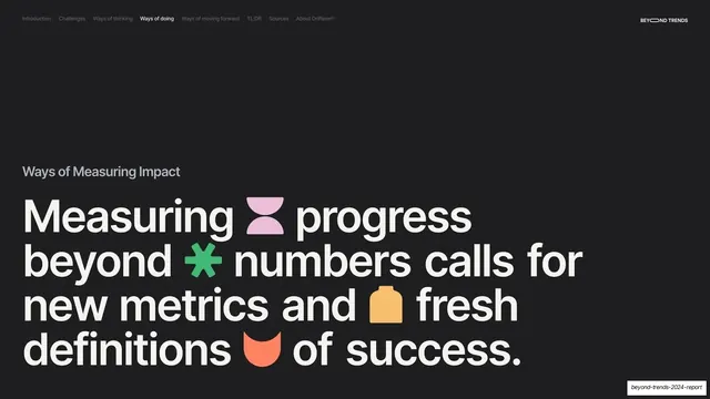
The repeated section-divider grammar (small label, oversized question, sparse colored glyphs on dark) used consistently for each of the report's pillars, so every transition feels identical and intentional.
Reuse notes
Reuse as one of a matched set of section dividers across a long report. The consistent dark treatment and question framing make navigation obvious. Keep the glyph set and headline scale identical to the other dividers.