Preview image. Unlock full-res
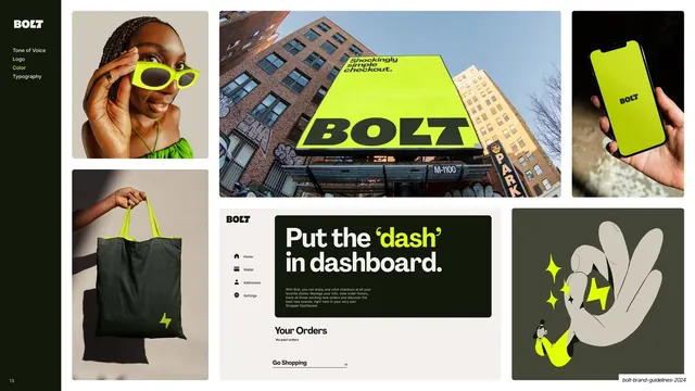
Sidebar-nav slide with a mixed-size grid of brand applications (eyewear, tote, billboard, phone, dashboard UI, illustration) all keyed to Lightning Yellow on black.
Summary
A color-in-use moodboard: a multi-size grid of real and mocked brand touchpoints, all built around Lightning Yellow and Bolt Black.
Visual description
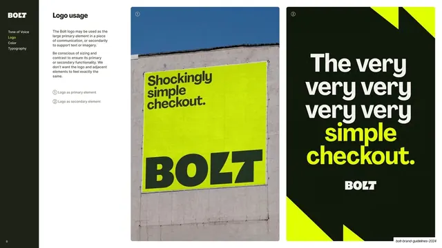
A content slide with the dark sidebar (Color highlighted yellow). The rest is a mixed-size masonry grid of brand applications: a portrait of a person in yellow sunglasses, a dark canvas tote with a yellow bolt and yellow handles, a large billboard photo of a yellow "BOLT" poster on a building, a phone in hand showing the yellow app, a Shopper Dashboard UI mockup with the headline "Put the 'dash' in dashboard." (the word "dash" in yellow), and a green-tinted illustration of a hand making a peace sign with sparkles. Yellow-on-black recurs across every tile.
Key takeaway
Proving a two-color system across a wide spread of touchpoints (apparel, OOH, product UI, illustration, lifestyle) in one grid, so the palette's range and consistency are shown rather than asserted. The single accent color ties wildly different media together.
Reuse notes
A reusable color-in-application or brand-world moodboard page. Mixing photography, product UI, merch, and illustration in one grid sells the breadth of a system. Needs genuinely good assets across several media to carry it; weak placeholders flatten the effect.
From this deck: Color in application moodboard
View deck
More like this

Keep what you find
A free account saves references to boards and can send you a weekly email of picks based on what you save.
To see every result, go Pro.