Preview image. Unlock full-res
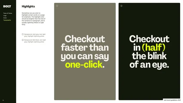
Sidebar-nav slide demonstrating word-level color highlighting with two tall panels of oversized copy where a single phrase is set in Lightning Yellow.
Summary
The highlights page: how to emphasize words by recoloring them, shown with two tall panels of oversized copy where one phrase jumps to Lightning Yellow.
Visual description
A content slide with the dark sidebar (Typography highlighted yellow) and copy explaining that highlight words should be brighter than the surrounding text, usually Lightning Yellow or Light Grey, with a two-item numbered legend. Two tall panels fill the right side, each with a ringed reference number. Panel (1) is warm grey with off-white oversized type "Checkout faster than you can say one-click." where "one-click." is Lightning Yellow. Panel (2) is near-black with off-white type "Checkout in (half) the blink of an eye." where "(half)" is Lightning Yellow.
Key takeaway
Defining text emphasis as a single high-brightness color swap on one key phrase inside an otherwise neutral block of oversized type, with the rule that the highlight must be brighter than its surroundings. It keeps emphasis loud but disciplined to one move.
Reuse notes
A reusable highlights or emphasis page for brands that signal key words with color rather than bold or italic. The "brighter than the rest" rule is a clean, enforceable principle. Best when the highlight color is the brand's most saturated hue, as here.
From this deck: Text highlights
View deck


More like this







Keep what you find
A free account saves references to boards and can send you a weekly email of picks based on what you save.
To see every result, go Pro.