Preview image. Unlock full-res
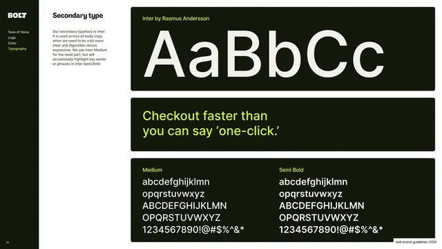
Sidebar-nav slide specifying Inter as the body typeface, shown as a giant AaBbCc specimen, a yellow sample line, and Medium and Semi Bold character sets.
Summary
The secondary typeface page: Inter (Rasmus Andersson) for body copy, shown as a giant specimen, a sample sentence, and Medium and Semi Bold character sets.
Visual description
A content slide that mirrors the primary-type page exactly, for consistency: dark sidebar (Typography highlighted yellow), "Secondary type" copy describing Inter, then three near-black rounded panels. The top shows a huge off-white "AaBbCc" with a yellow "Inter by Rasmus Andersson" label. The middle sets a yellow sample line, "Checkout faster than you can say 'one-click.'". The bottom splits into "Medium" and "Semi Bold" columns listing the full lowercase, uppercase, numeral, and symbol sets.
Key takeaway
Presenting the secondary typeface on an identical template to the primary one, so the type chapter reads as a matched pair and the difference between display and body roles is clear from layout parity rather than explanation.
Reuse notes
A reusable secondary/body typeface page. Keeping the exact same specimen template across primary and secondary type is a small move that makes a guideline feel rigorous. Inter is a common, freely available body workhorse pairing.
From this deck: Secondary type - Inter
View deck


More like this







Keep what you find
A free account saves references to boards and can send you a weekly email of picks based on what you save.
To see every result, go Pro.