Preview image. Unlock full-res
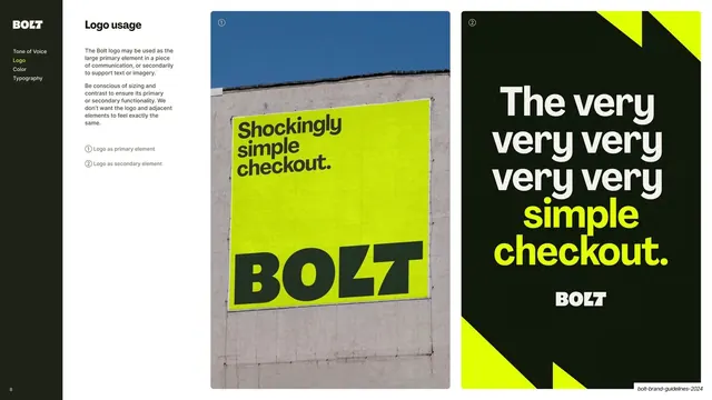
Sidebar-nav slide contrasting the logo used large on a billboard photo against the logo as a small sign-off under an oversized headline.
Summary
The primary-versus-secondary logo page: a tall billboard photo where BOLT is the hero, beside a dark layout where BOLT is a small sign-off under a big headline.
Visual description
A content slide with the dark sidebar (Logo highlighted yellow) and "Logo usage" copy with a two-item numbered legend. Two tall portrait panels fill the right side. Panel (1) is a photo of a yellow building-side poster reading "Shockingly simple checkout." with a huge black BOLT mark below, against a blue sky. Panel (2) is near-black with an oversized off-white headline "The very very very very simple checkout." (the last two words in yellow) and a small BOLT wordmark sitting underneath as a sign-off, flanked by clipped yellow bolt shapes.
Key takeaway
Teaching logo hierarchy by direct comparison: the same mark shown once as the dominant element and once as a quiet sign-off, so the rule is read instantly from the contrast rather than from text.
Reuse notes
A reusable page for explaining when a logo leads versus supports. The side-by-side primary/secondary framing is broadly applicable. Benefits from a strong real or mocked application photo to make the "primary" case feel real.
From this deck: Logo as primary vs secondary element
View deck

More like this







Keep what you find
A free account saves references to boards and can send you a weekly email of picks based on what you save.
To see every result, go Pro.