Preview image. Unlock full-res
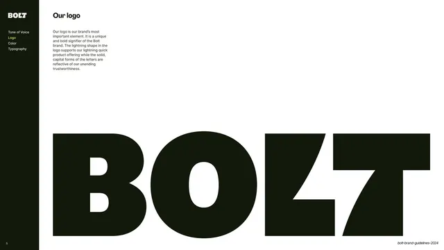
Sidebar-nav slide explaining the logo with a single huge near-black BOLT wordmark bleeding across the bottom of the frame.
Summary
The primary logo introduction: a short rationale paragraph paired with one enormous near-black BOLT wordmark anchored to the bottom of the slide.
Visual description
A warm off-white (#F3F1EE) slide. The dark left sidebar carries the BOLT mark and the four-item nav (Logo highlighted yellow). A second column holds the bold "Our logo" title and a paragraph of Inter body copy explaining the lightning shape and the solid capital letterforms. The lower two-thirds is filled by an oversized near-black "BOLT" wordmark set so large it bleeds off the left and right edges; the embedded lightning slash where the "L" and "T" meet is clearly visible, as is the cut through the "T".
Key takeaway
Introducing a wordmark by showing it at extreme scale, cropped off both sides, so the construction of the letterforms (here the lightning slash) becomes the subject. The supporting copy stays small and lets the mark dominate.
Reuse notes
A strong pattern for the opening logo page of any brand guideline. Cropping the wordmark off-canvas reads as confident and lets viewers see the type detail up close. Needs a logotype whose letterforms reward being seen large.
From this deck: Our logo - primary wordmark
View deck

More like this








Keep what you find
A free account saves references to boards and can send you a weekly email of picks based on what you save.
To see every result, go Pro.