Preview image. Unlock full-res
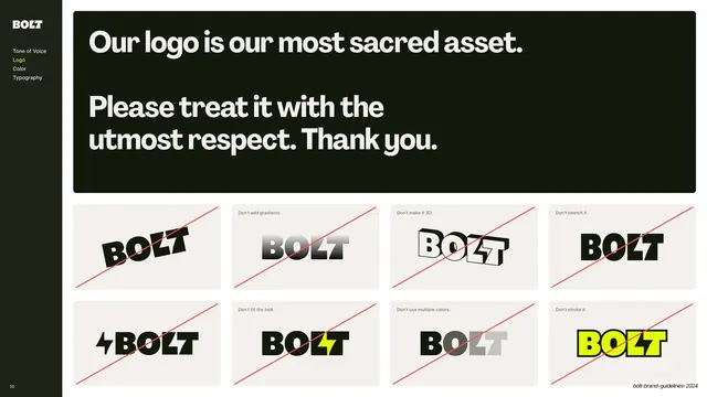
Sidebar-nav slide with an oversized "most sacred asset" statement panel above a 4x2 grid of crossed-out logo misuse examples.
Summary
The logo misuse page: a big "treat it with respect" statement over an eight-cell grid of crossed-out wrong uses of the mark.
Visual description
A content slide with the dark sidebar (Logo highlighted yellow). A wide near-black rounded panel across the top carries an oversized off-white statement: "Our logo is our most sacred asset. Please treat it with the utmost respect. Thank you." Below it sits a 4x2 grid of off-white cells, each showing the BOLT mark used incorrectly (rotated, gradient, 3D, stretched, with an added bolt icon, filled bolt, multiple colors, outlined) with a small grey caption naming the error and a thin red diagonal line struck through each example.
Key takeaway
Fronting the misuse page with one large, almost cheeky statement about protecting the mark, then backing it with a dense, scannable do-not grid. The tone-setting headline makes a dry rules page feel on-brand.
Reuse notes
The canonical logo-misuse layout (statement plus crossed-out grid) for any guideline. Eight cells covering rotation, color, effects, and proportion is a good default checklist. Pair with the clearspace and logo-color pages.
From this deck: Logo misuse examples
View deck


More like this









Keep what you find
A free account saves references to boards and can send you a weekly email of picks based on what you save.
To see every result, go Pro.