Preview image. Unlock full-res
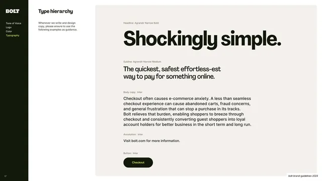
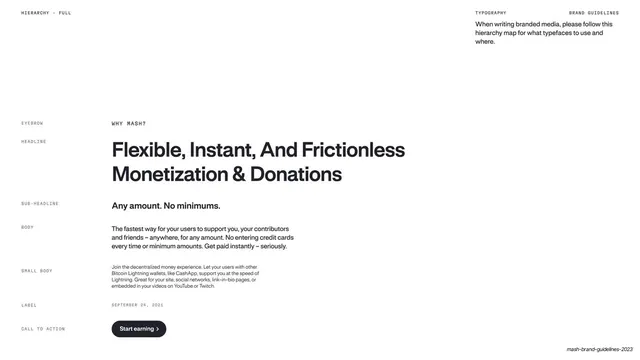
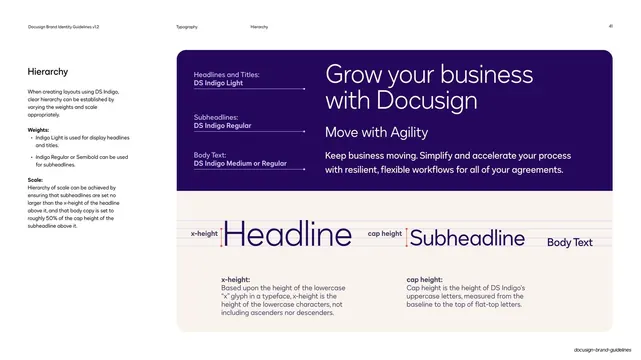
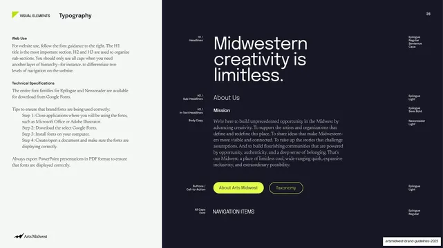
Sidebar-nav slide laying out the full type scale from headline through subline, body, annotation, and button, each labelled with its typeface and role.
Summary
The type-hierarchy page: a single stacked specimen running headline to button, each level tagged with its typeface and function.
Visual description
A content slide with the dark sidebar (Typography highlighted yellow) and a short "Type hierarchy" intro. The right side is one large warm off-white panel showing the full scale top to bottom: an oversized near-black headline "Shockingly simple." (Agrandir Narrow Bold); a smaller subline "The quickest, safest effortless-est way to pay for something online." (Agrandir Narrow Medium); a paragraph of body copy (Inter); a one-line annotation "Visit bolt.com for more information." (Inter); and a near-black pill button with yellow "Checkout" label (Inter). Each step carries a small grey role-and-typeface tag to its upper left.
Key takeaway
Showing the entire type system as one continuous, real piece of copy from headline to button, with each level labelled by role and typeface, so the relative sizes and the display-to-body switch are read in context rather than as an abstract scale chart.
Reuse notes
A strong type-hierarchy or type-scale page. Building the example out of one coherent message (not lorem ipsum) makes the hierarchy legible and on-brand. Including the button style ties type into UI. Directly reusable for any guideline's type chapter.
From this deck: Type hierarchy
View deck

More like this

Keep what you find
A free account saves references to boards and can send you a weekly email of picks based on what you save.
To see every result, go Pro.